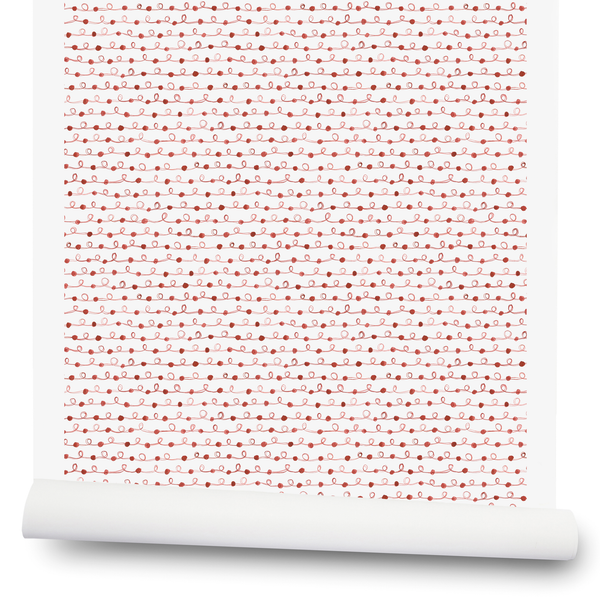
Our Wallpaper Grounds
We often get questions about the differences in our wallpaper grounds. We launched with our clay-coated paper, but now we have more options, including non-woven fibre paper and non-woven vellum. We want to help you understand why we choose the ground for individual patterns and colors, and what they feel and look like.
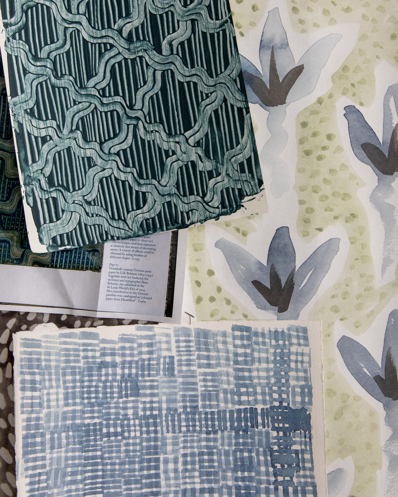
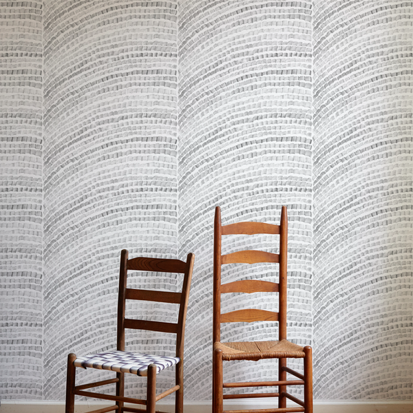
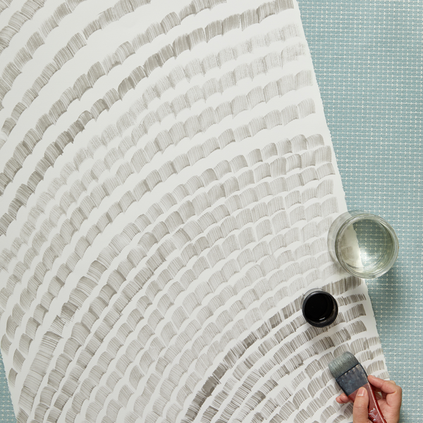
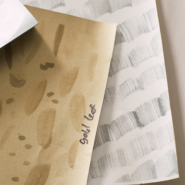
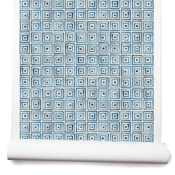
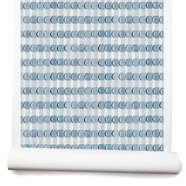
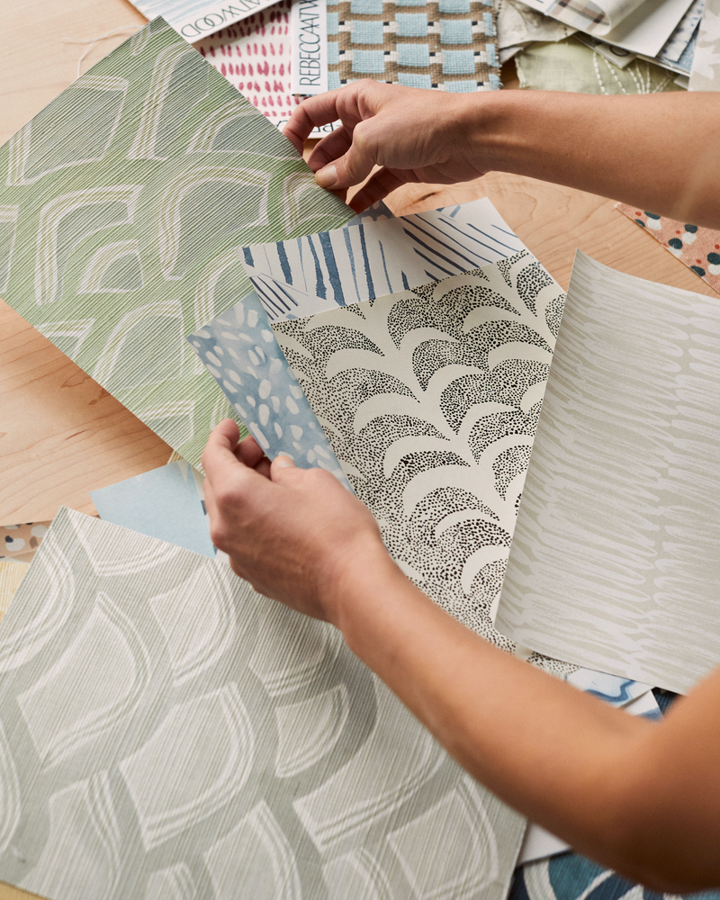
For starters, it’s important to understand how the ground affects the artwork. A paper’s texture, thickness, and absorbency determines how colors will sit on it, whether it will soak up ink or gouache or watercolor paint. It decides how saturated and dimensional the final design will look, whether the colors will pool and seep or make crisp, sharp lines. Choosing the right ground for a pattern is a tactile experience, as much as part of the art-making process as selecting the right brush. For my work in the studio, it starts with going to the art supply store to peruse the paper options in person. You can touch it and feel the subtle shifts in texture, how rough or smooth it is. You can hold it up to the light and see exactly how matte or how shiny it is. You can buy different kinds, take them home, and test painting on them. It’s incredible how the exact same pattern can look completely different on different types of paper. Often it’s subtle, but it is important. This practice informs what papers I then choose to print our wallpaper designs on.

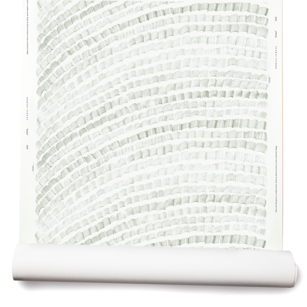
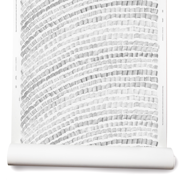
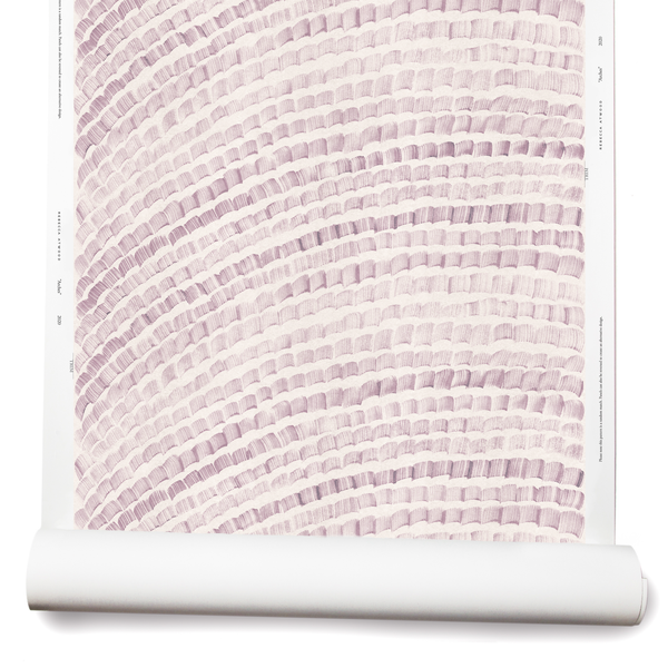
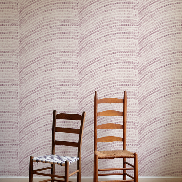
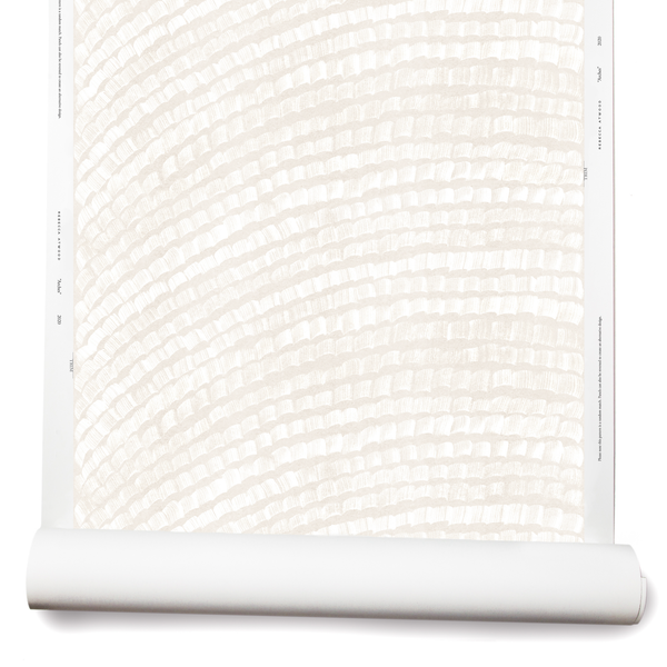
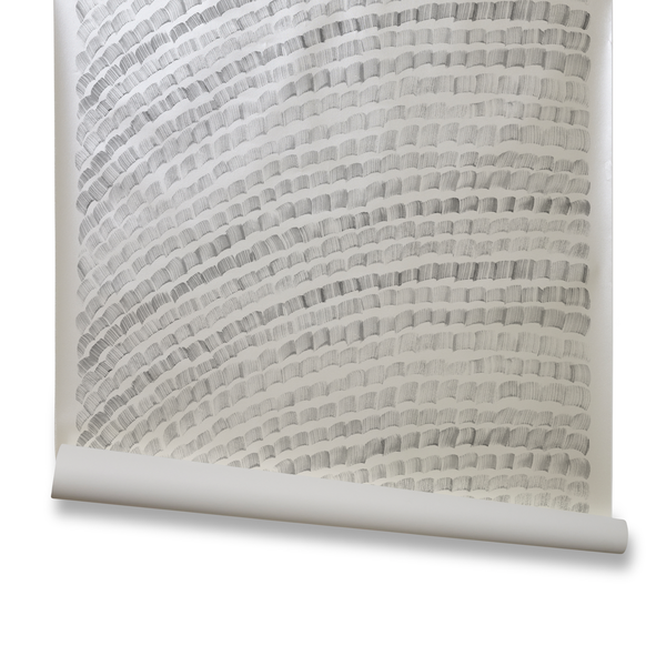
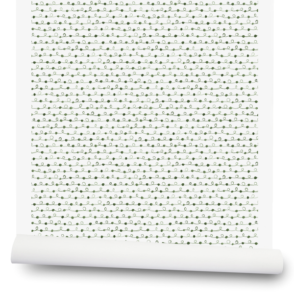
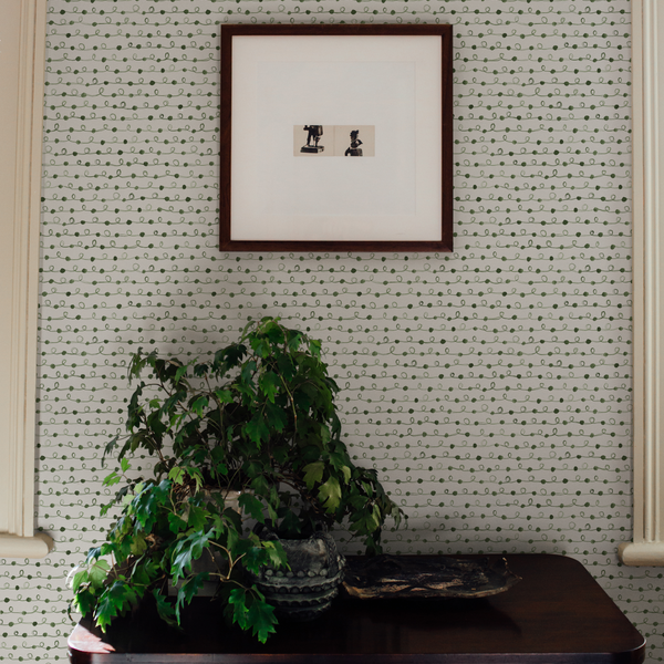
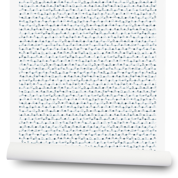
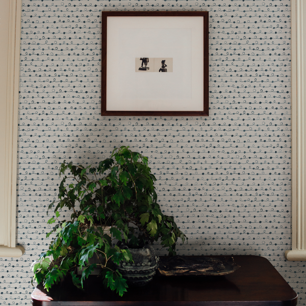
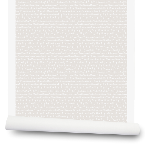
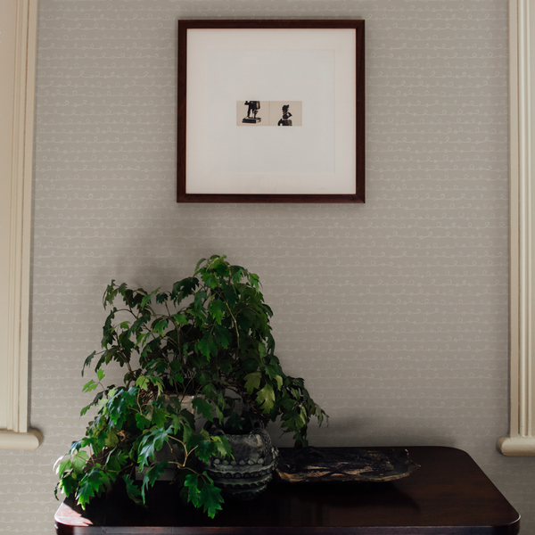
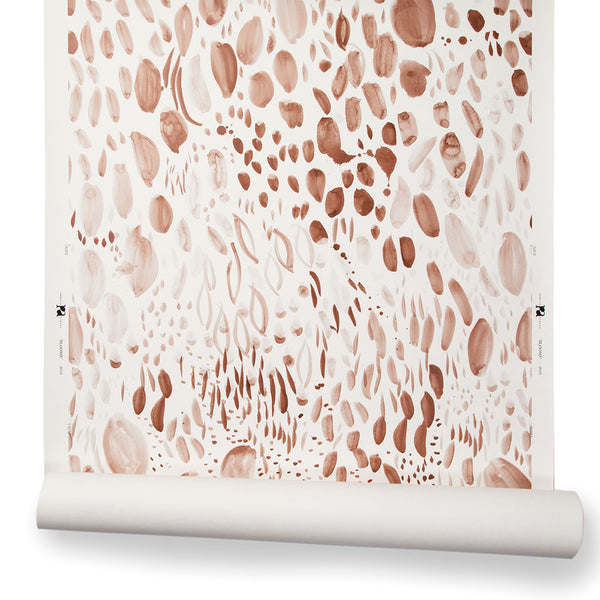
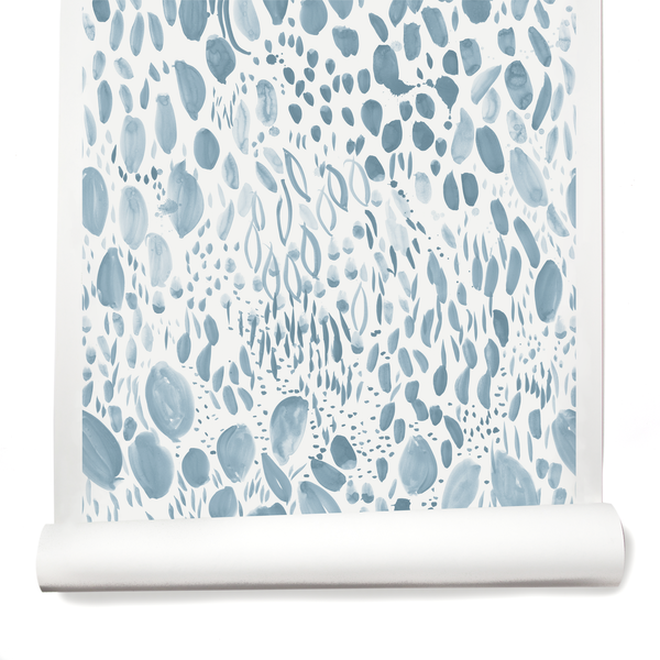
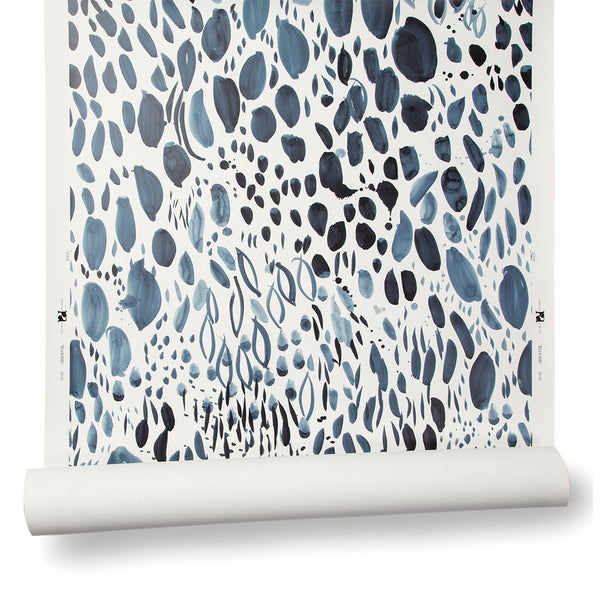
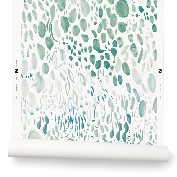
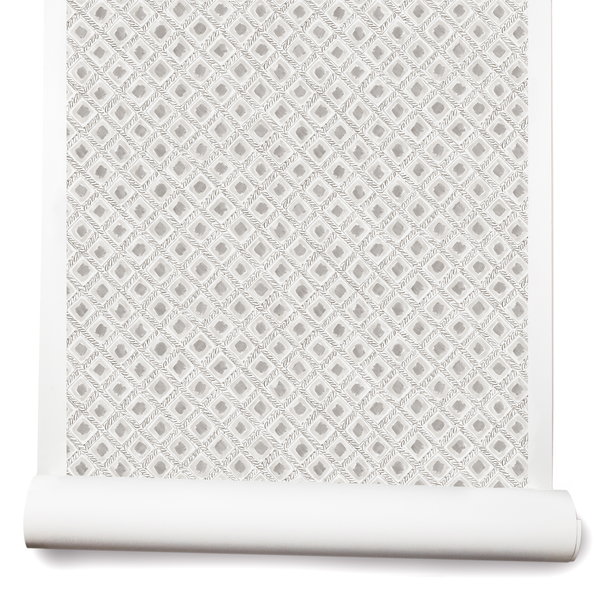
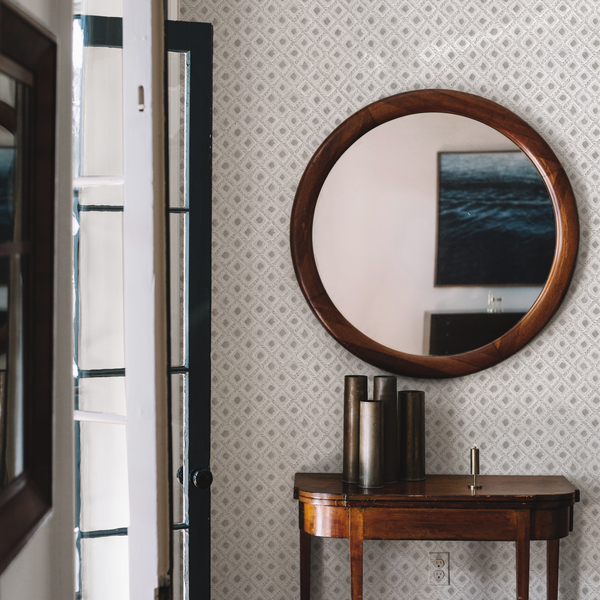
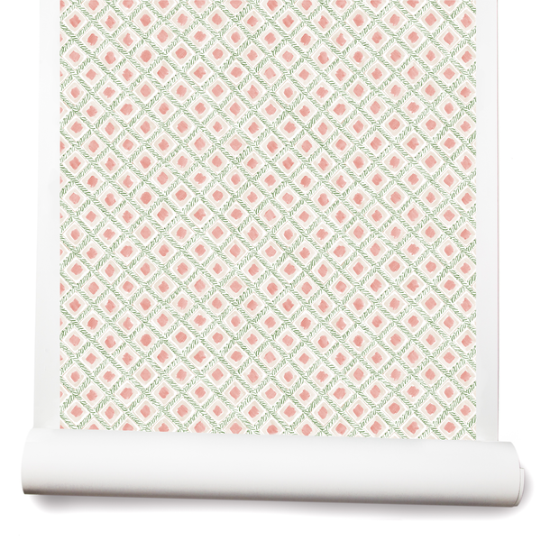
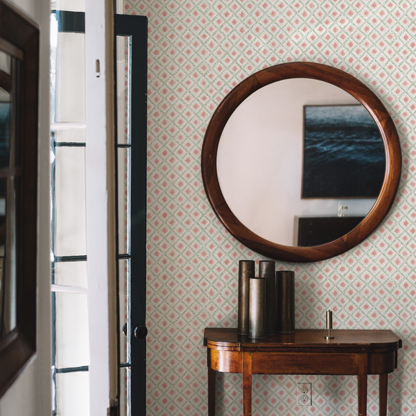
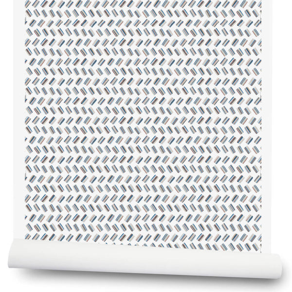
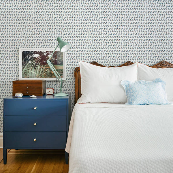
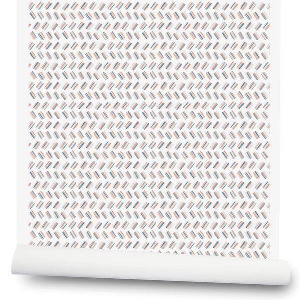
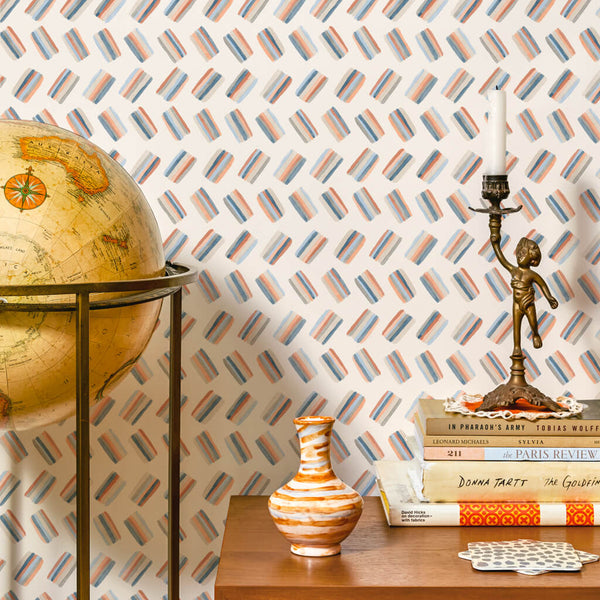
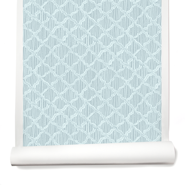
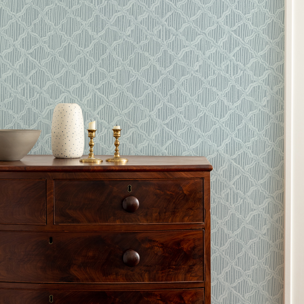
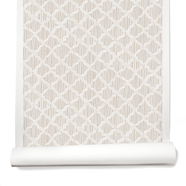
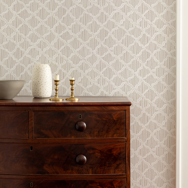
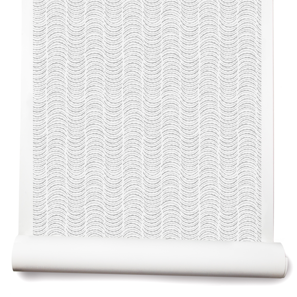
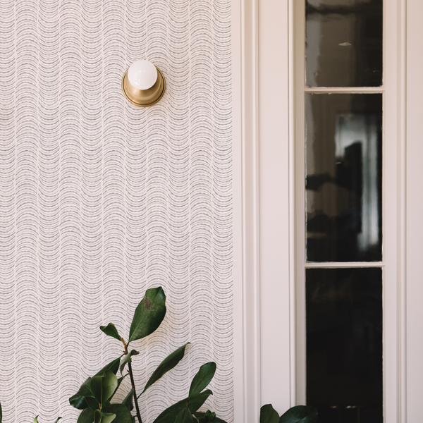
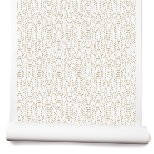
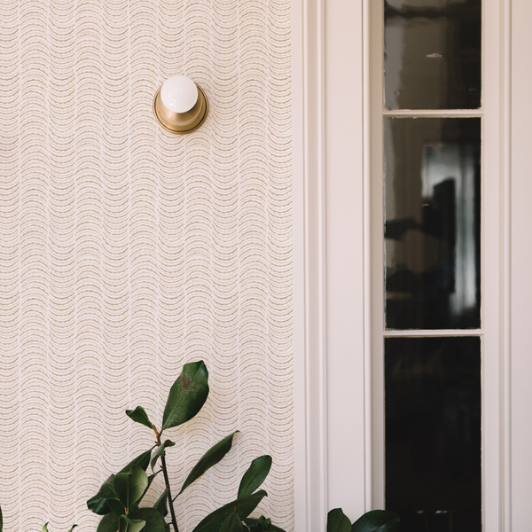
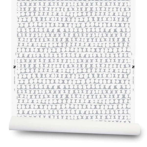
Clay-Coated Paper
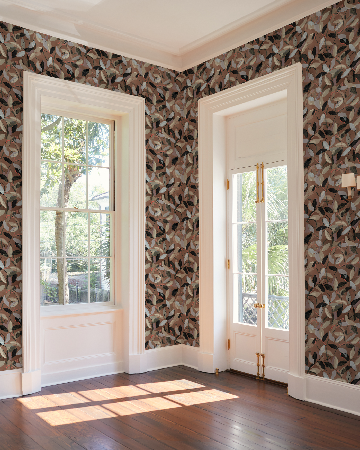
Our clay-coated paper is our original ground, our workhorse. If our wallpaper grounds were bedding, clay-coated paper would be crisp, smooth percale sheets. It’s a great standard paper that installs beautifully. Explore Clay-Coated Paper.
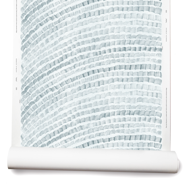
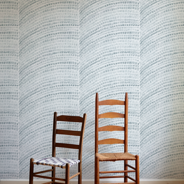
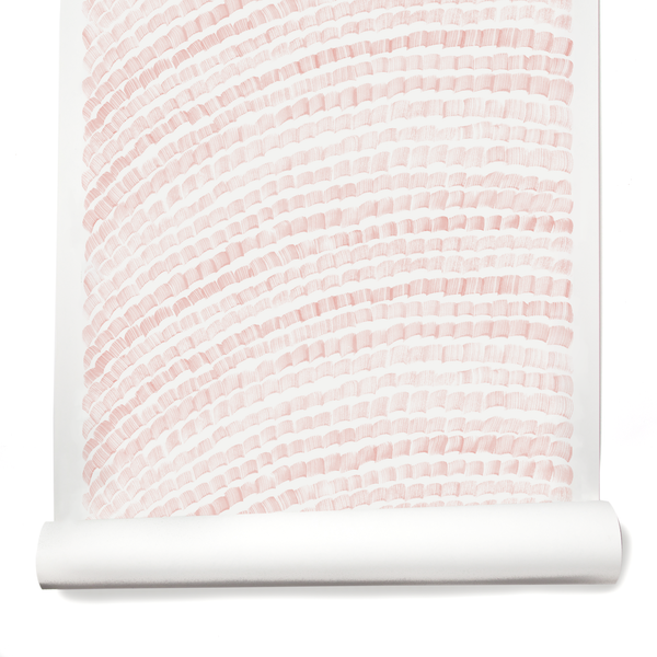
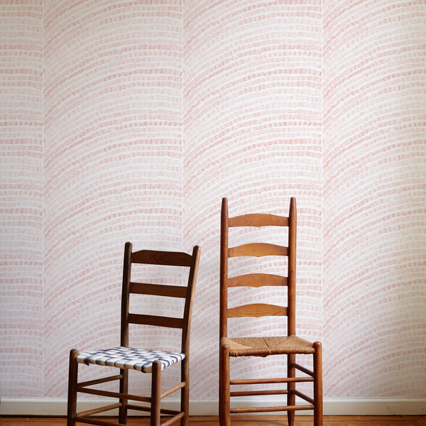
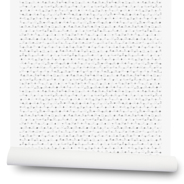
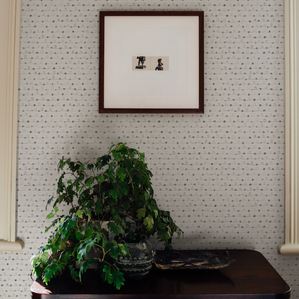
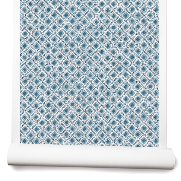
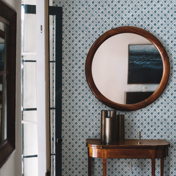
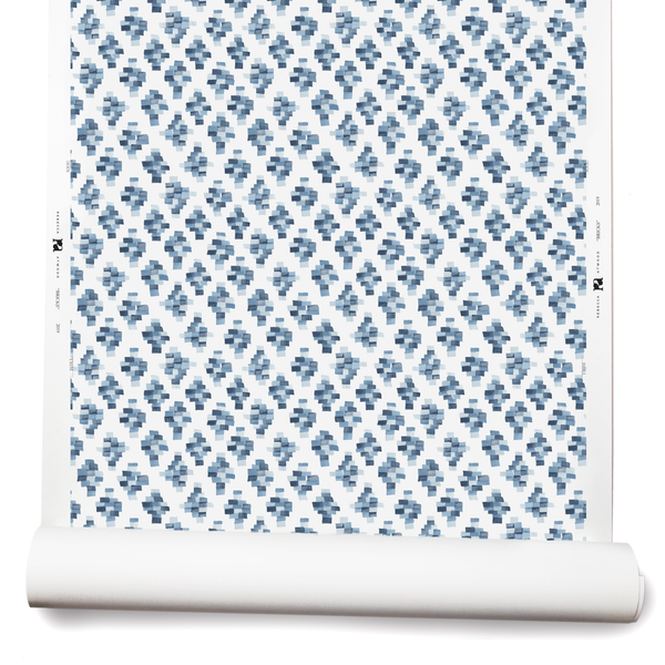
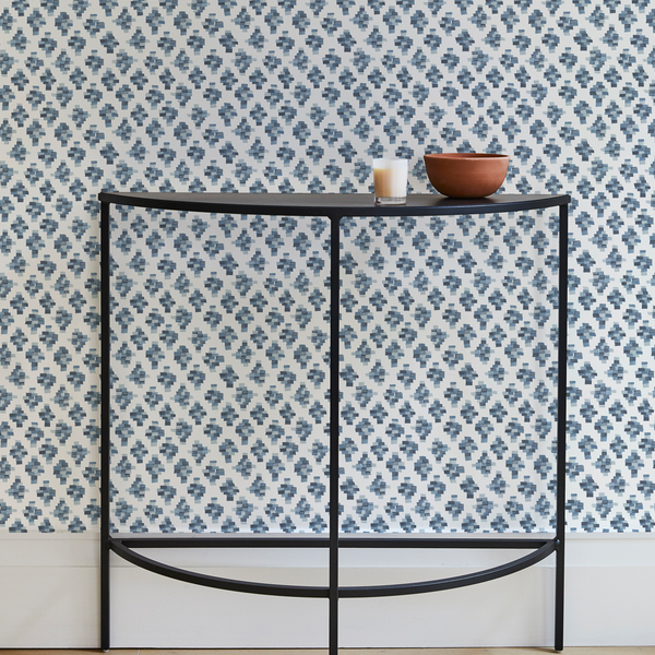
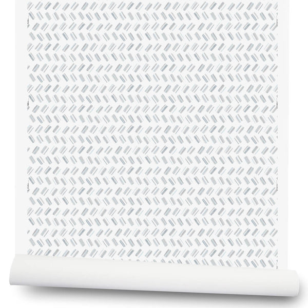
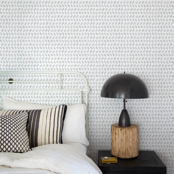
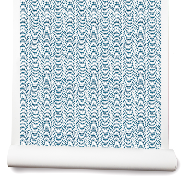
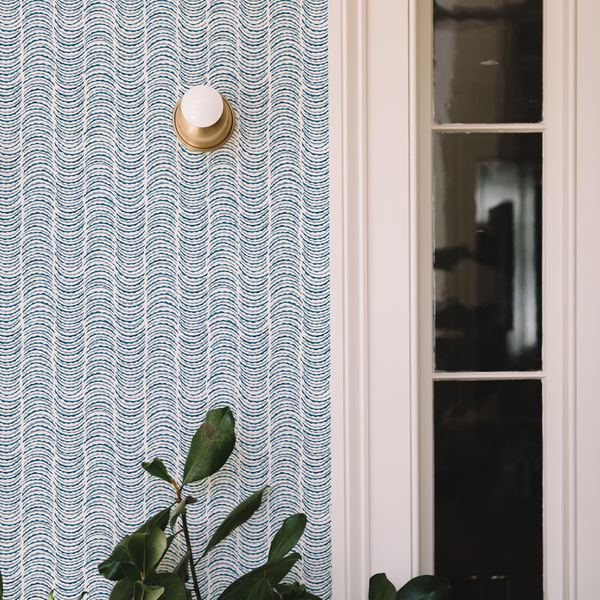
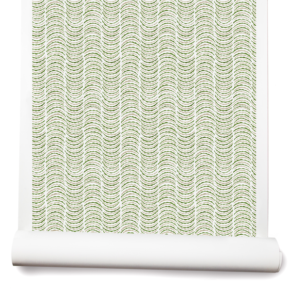
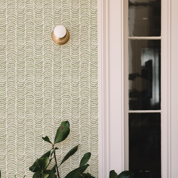
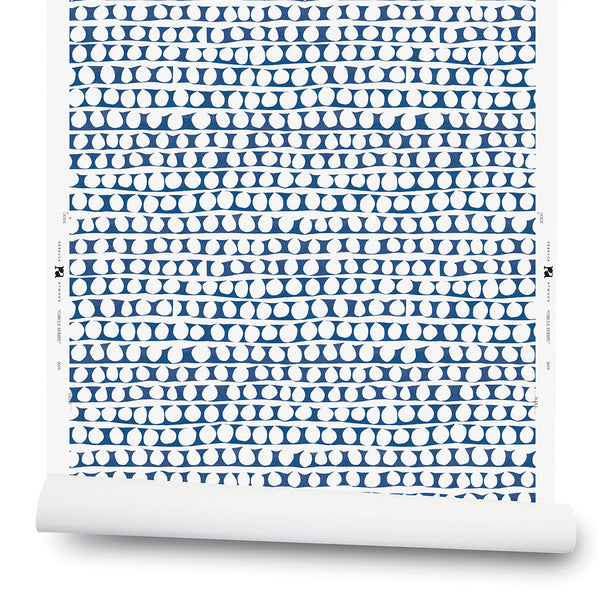
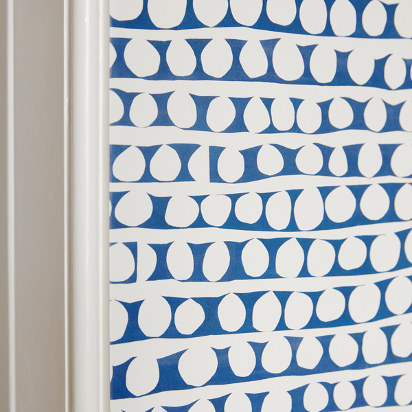
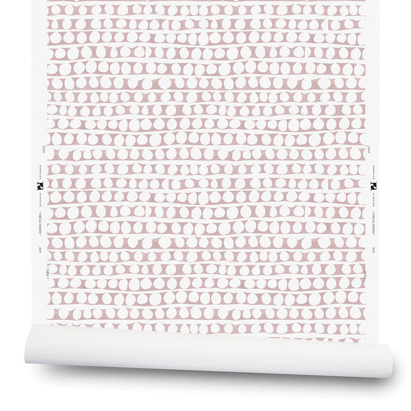
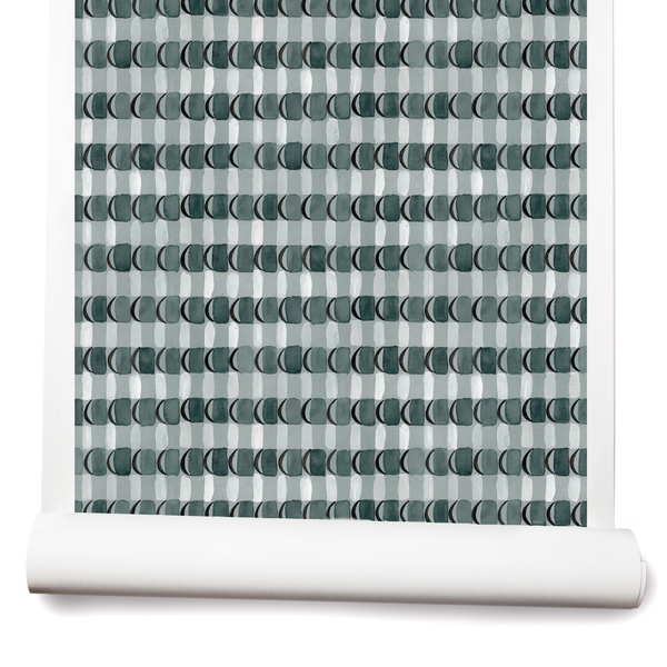
Non-Woven Fibre Paper
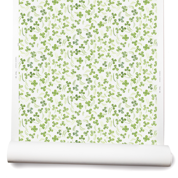
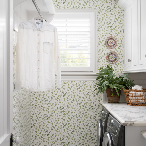
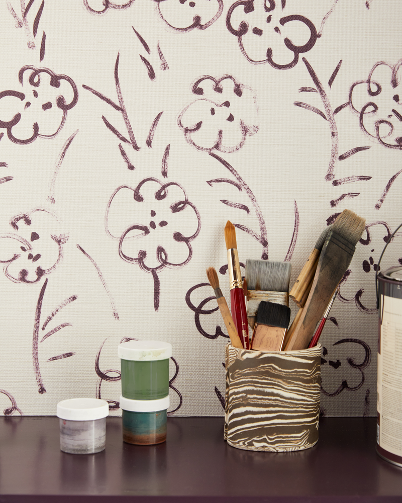
If clay-coated paper is our equivalent of percale sheets, then non-woven fibre paper is our washed linen. It’s more matte, textured, and absorbent than our clay-coated paper. I compare it to the art papers I love for painting. It reminds me of a mix of a rice paper with its subtle texture and a printmaking paper like Rives BFK paper that’s heavy and absorbs the ink a lot. It resonates with the quality of paper I look for when I’m working in gouache, watercolor, and ink. Colors soak into it, and the results look soft, almost like a fabric. Explore Non-Woven Fibre Paper.
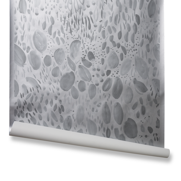
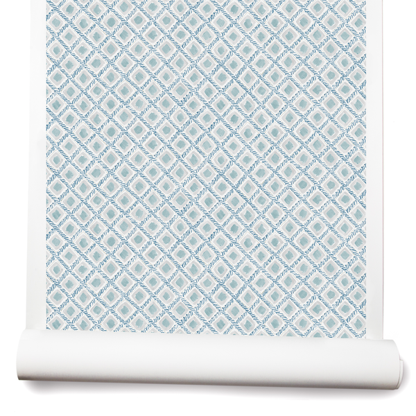
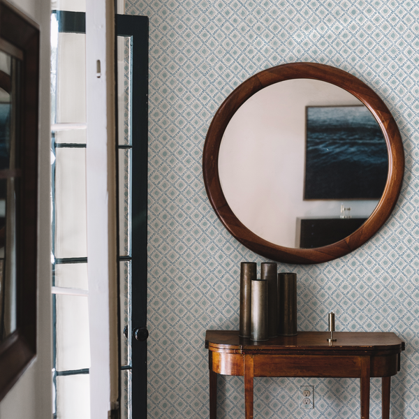
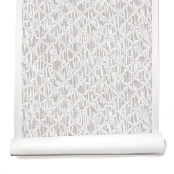
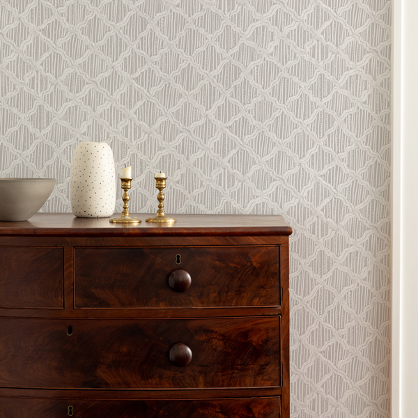
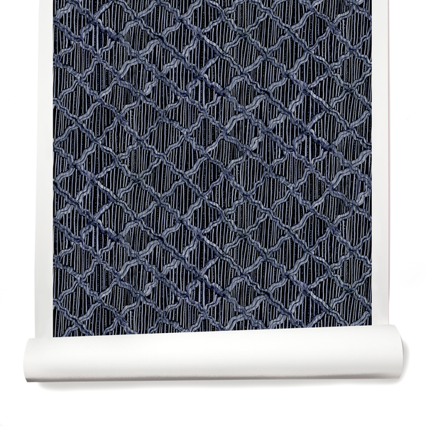
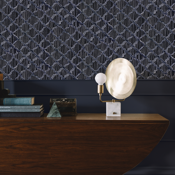
Non-Woven Vellum
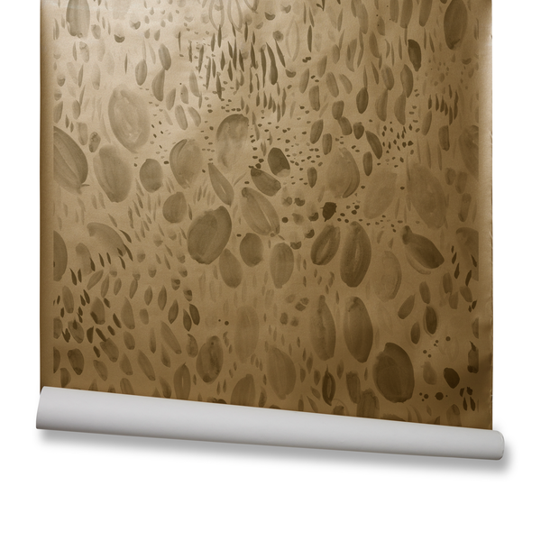
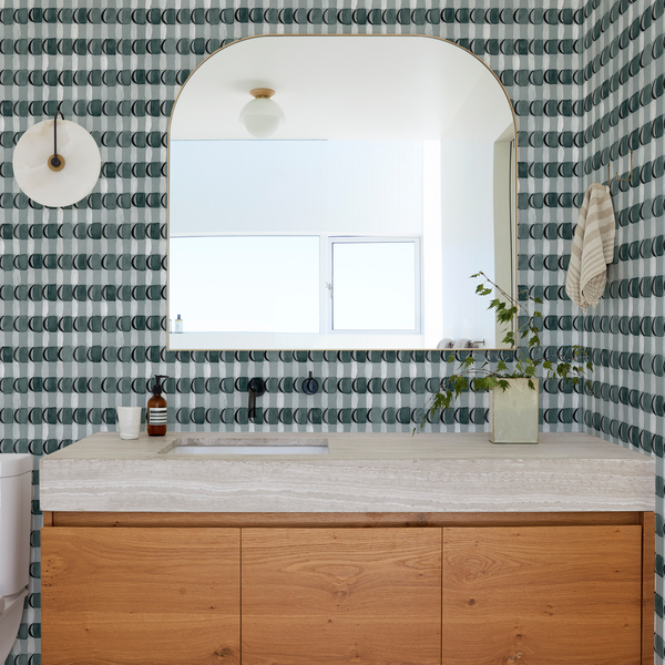
To continue our bedding analogy, you might think of our nonwoven vellum as a sateen. I think that darker colors look richest on nonwoven vellum. They get a different level of darkness, like an oil painting—it feels more like that kind of a finish. It has a refinement to it. It’s matte, but with a beautiful sheen. Deep colors like eggplant and inky blue take on a glow. Explore Non-Woven Vellum.
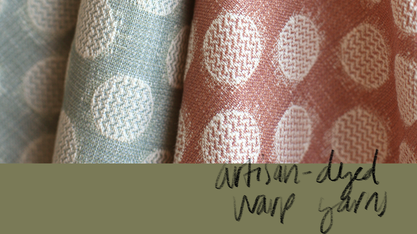
We also sometimes explore grasscloth and paperweave grounds too. I love that they’re natural fibers with organic variation, similar to the effect we get with textiles made using our artisan-dyed warp thread.
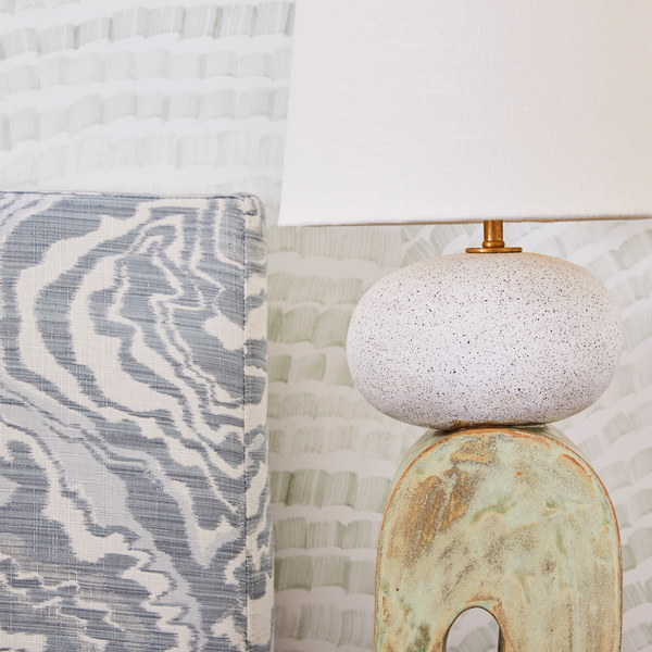
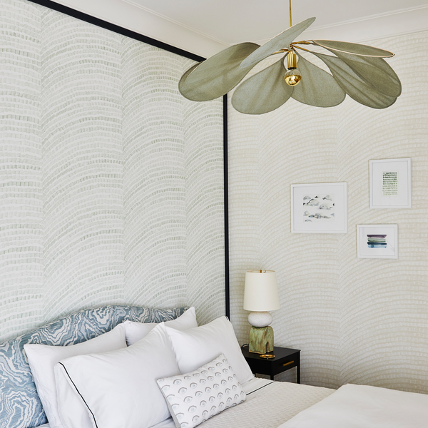
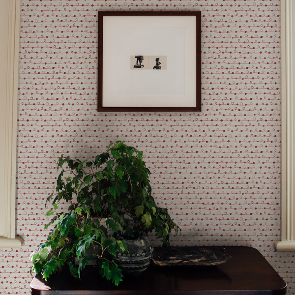
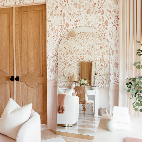
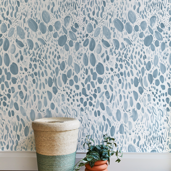
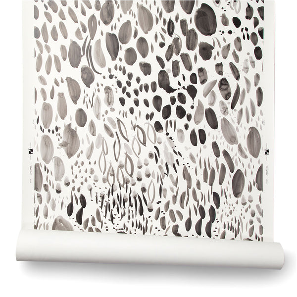
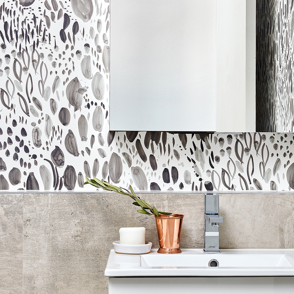
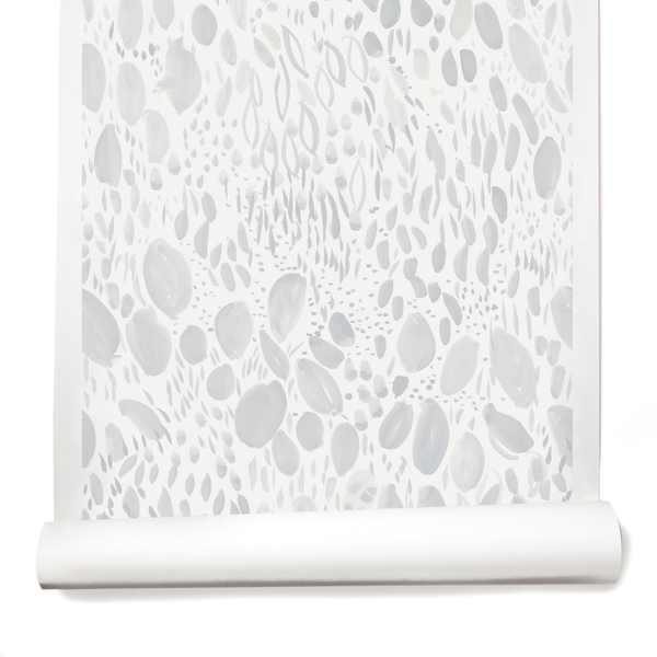
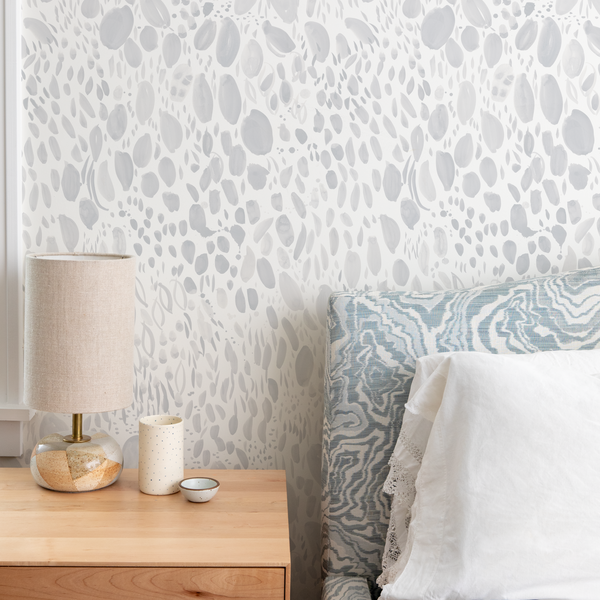
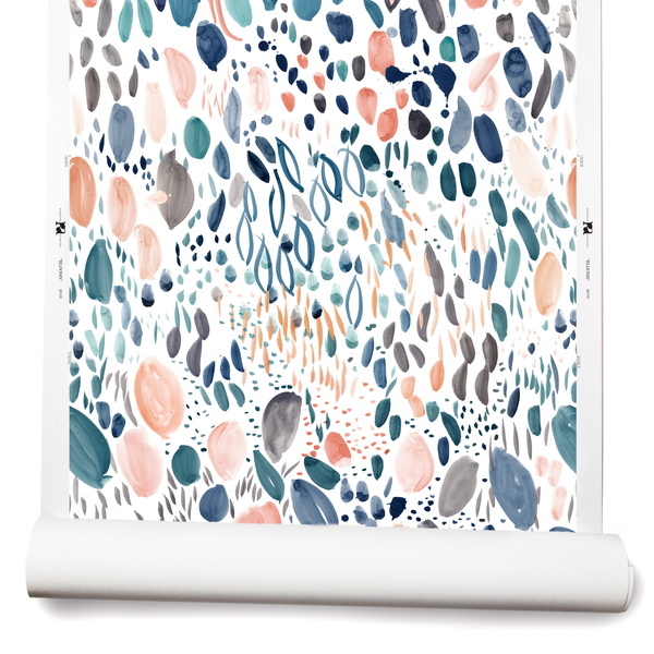
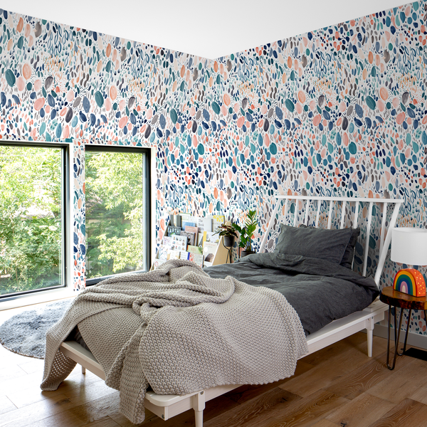
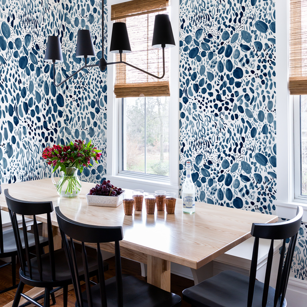
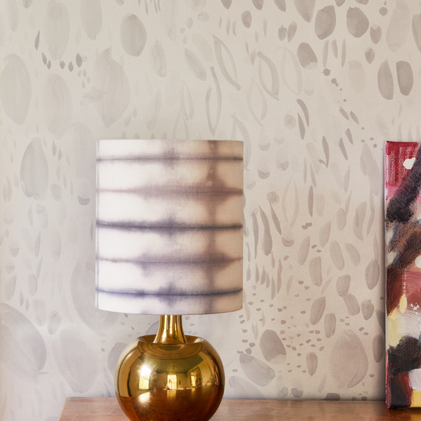
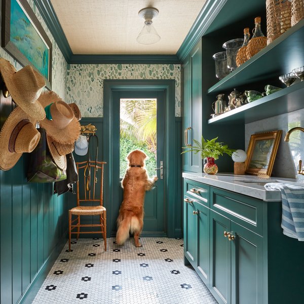
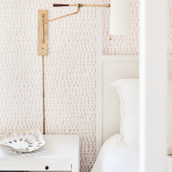
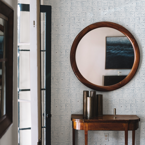
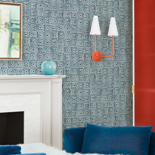
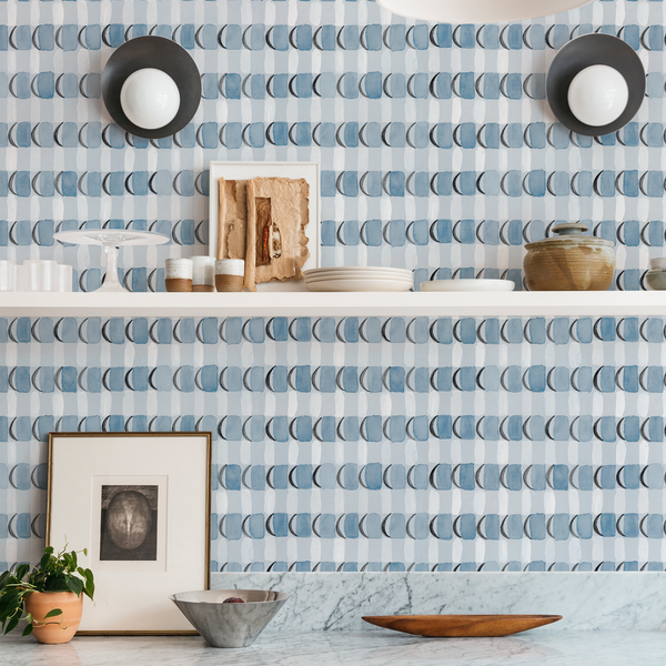
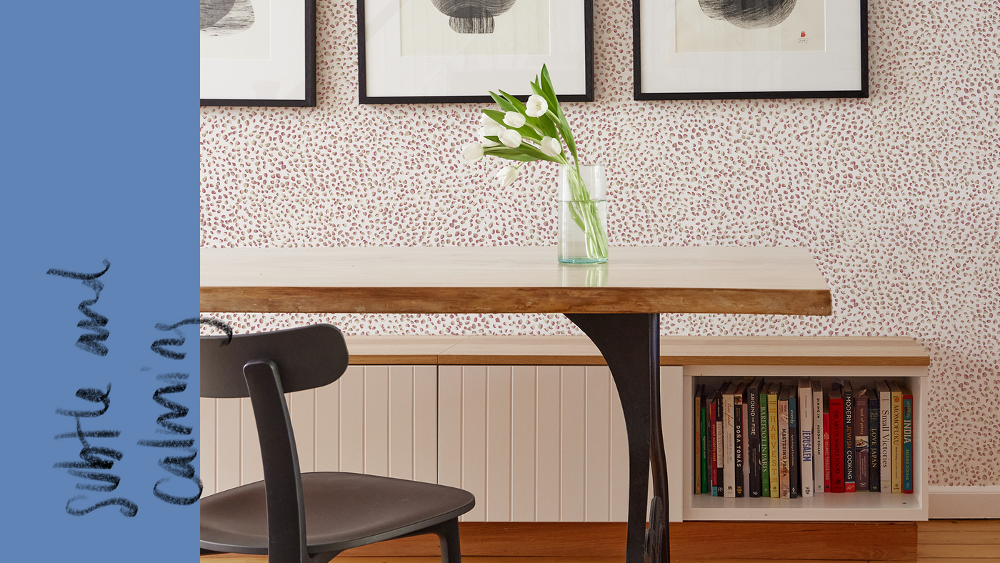
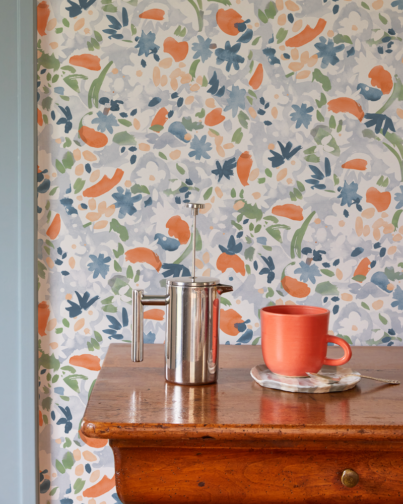
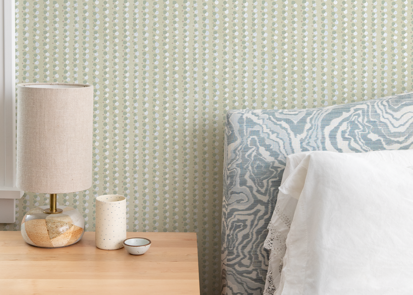
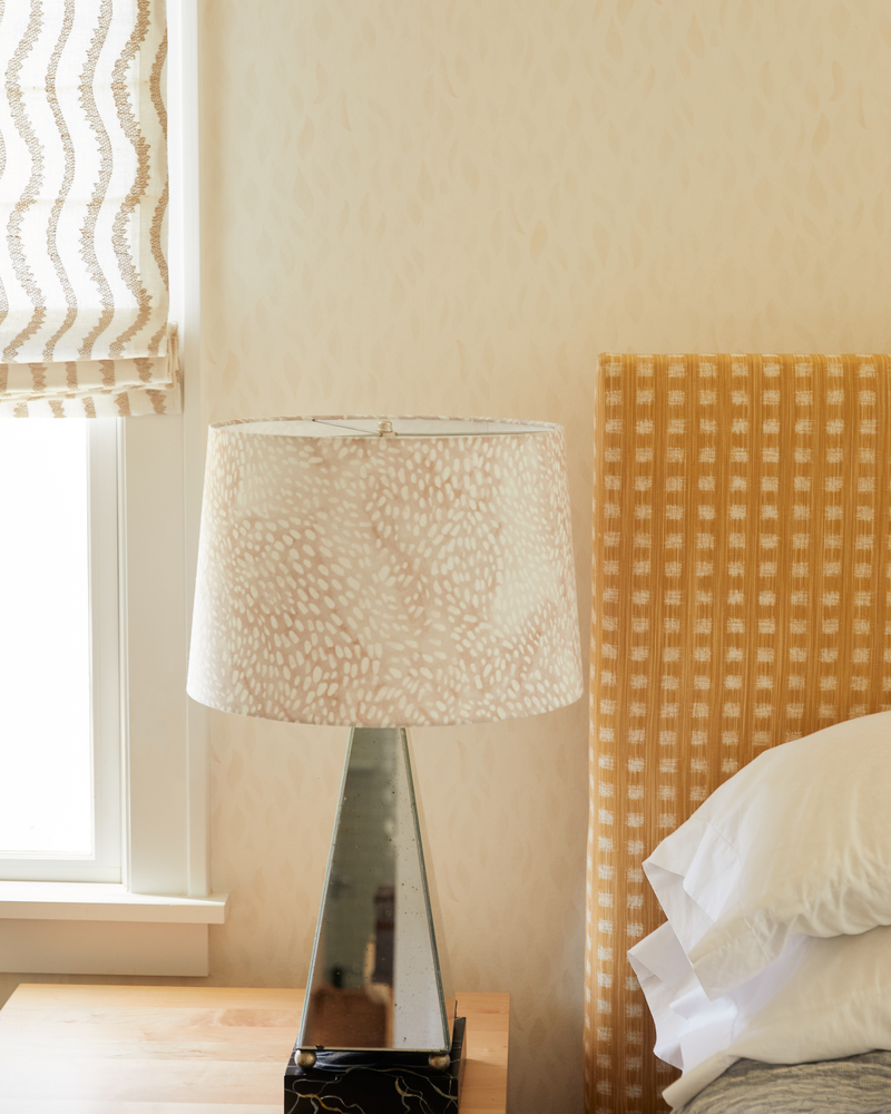
You’ll find that we offer the same pattern on different grounds depending on the color palette. For instance, we print Petals in Cloud Blue, Lilac, Ocean Blue, Pink-Peach, Sage, and Taupe-Blue on clay-coated paper, but we recently introduced the Shell colorway, our palest sandy hue, on non-woven fibre to give it that much more softness. I particularly love it for a bedroom—in fact, I used it in my own.
We’re constantly revisiting patterns and looking at different colors and grounds. If you’re interested in a combination we don’t currently offer, please let us know. Reach out for samples, send us your questions, and please tell us what you think. We love to hear from you.