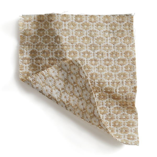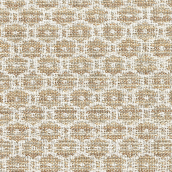
Rebecca’s Tips For Color Mixing Outdoors
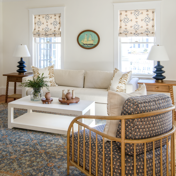
Spring is the perfect time to open up your home for outdoor entertaining. I tend to start with the colors I love when it comes to creating an outdoor landscape. Here are some of my favorite color combinations below!
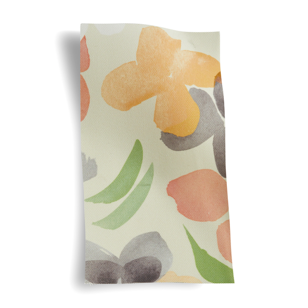
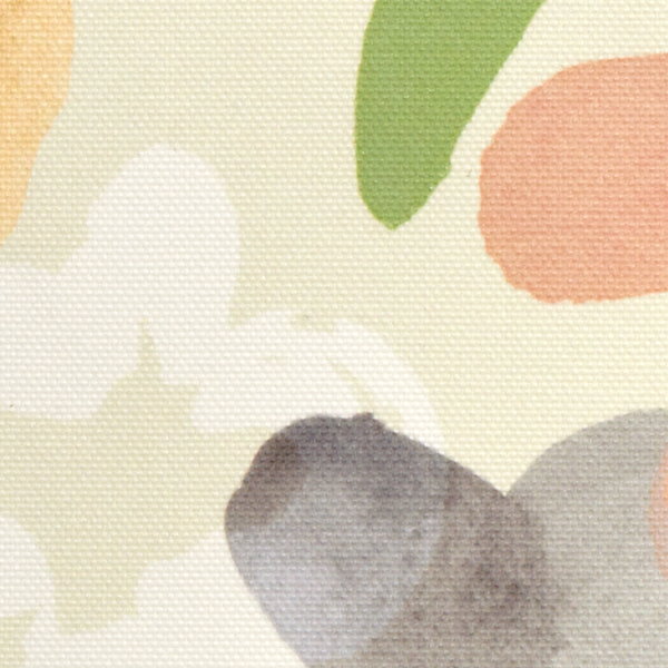
I love how laid-back and casual it feels to have people over once the weather starts getting warm. We’ll throw open the doors and take our gatherings out onto the porch or into the yard. It makes your house feel so good and alive to let the fresh air in and feel the energy of people coming and going. It feels good to bring out the colors and patterns I’ve been missing all winter too. Yellows that make me think of the centers of the daisies in my mom’s garden, greens that connect so beautifully with the trees outside, purples that look so charming against green… My favorite spring and summer colors draw on combinations from nature that I’ve noticed in my own yard or that I remember. That makes them the perfect foundation for an outdoor party.
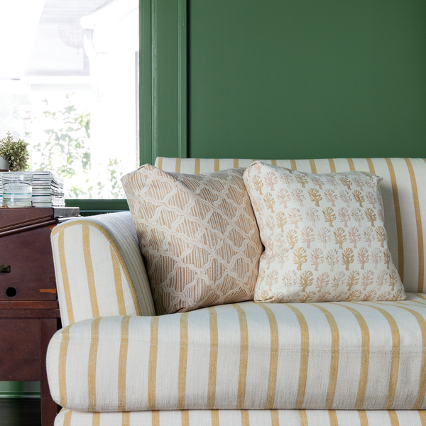
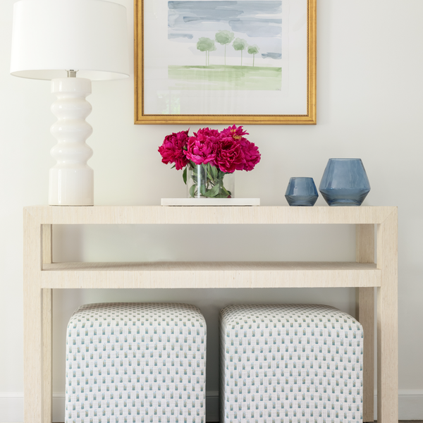
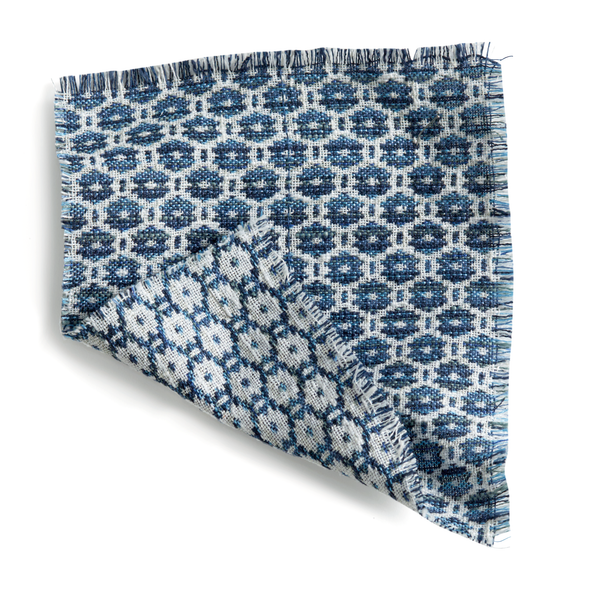
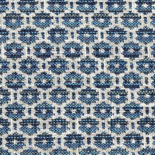
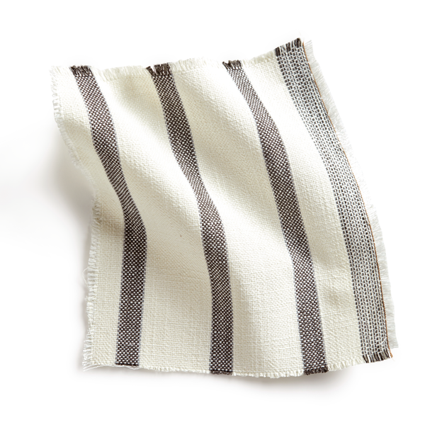
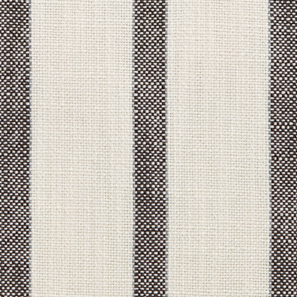
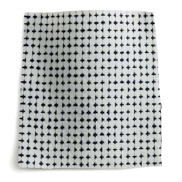
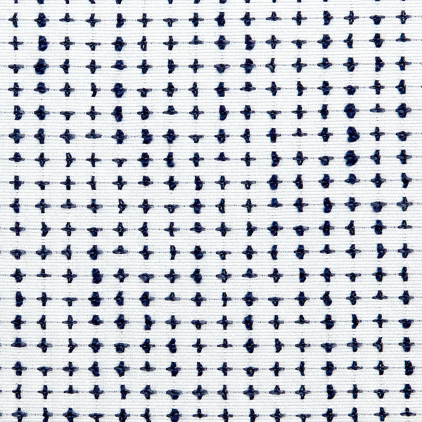
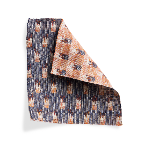
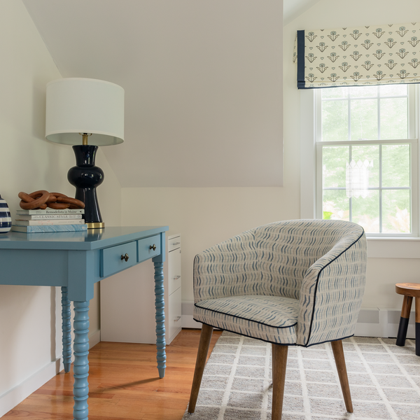
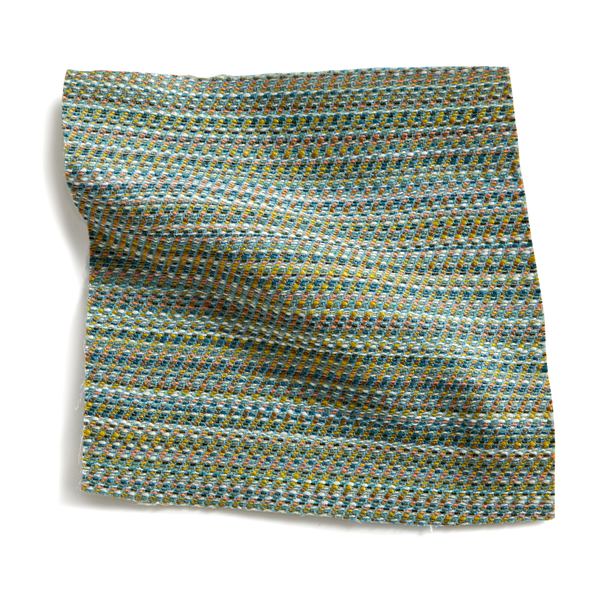
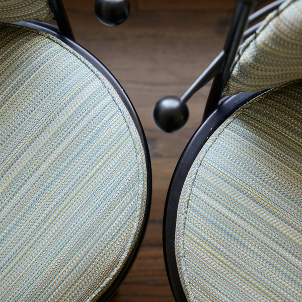
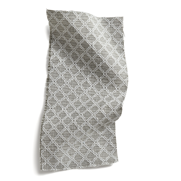
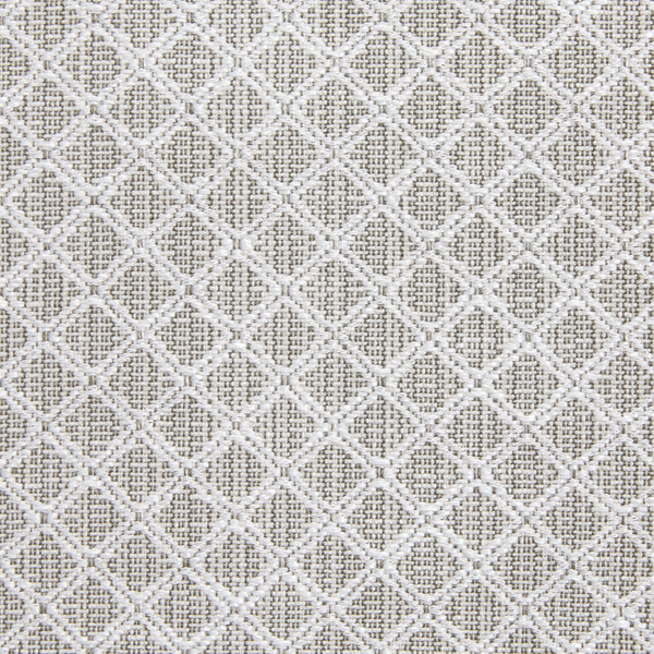
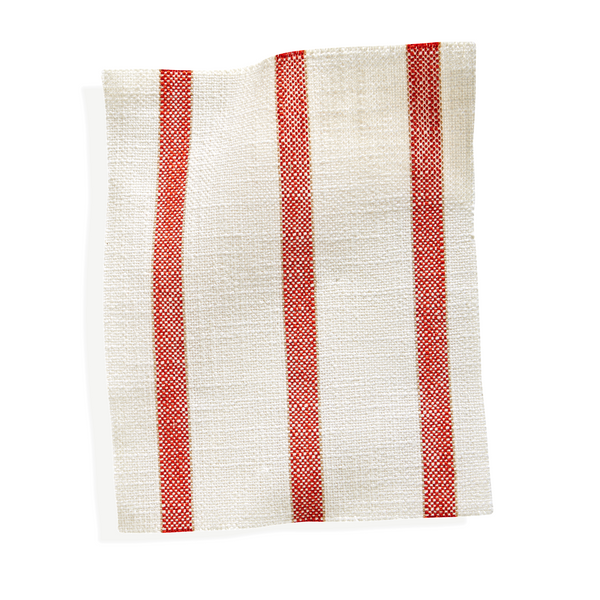
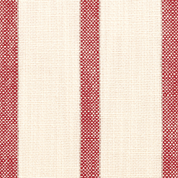
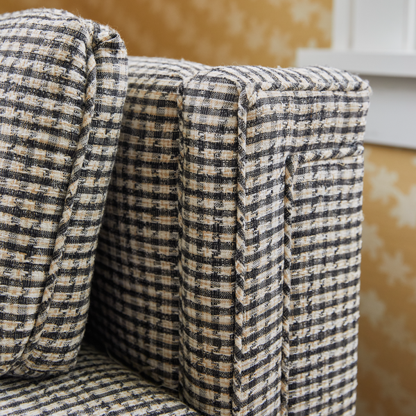
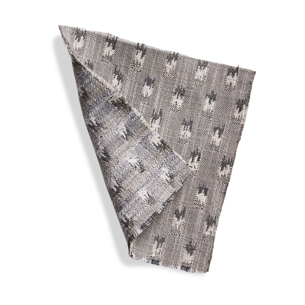
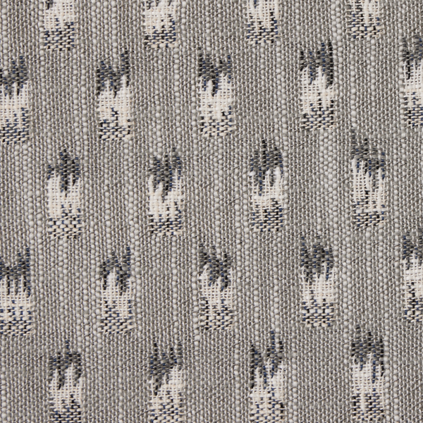
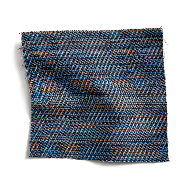
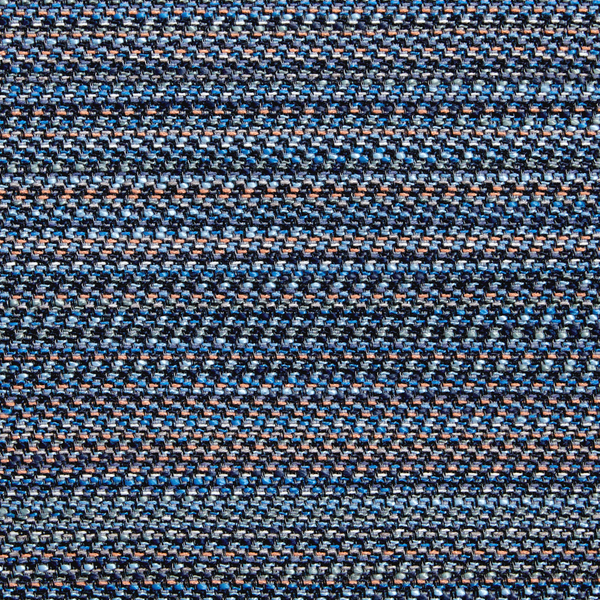
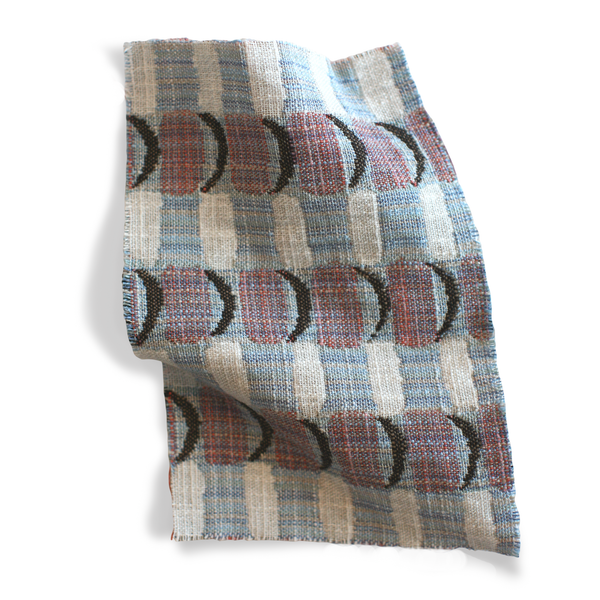
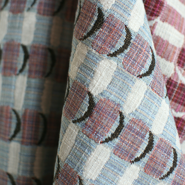
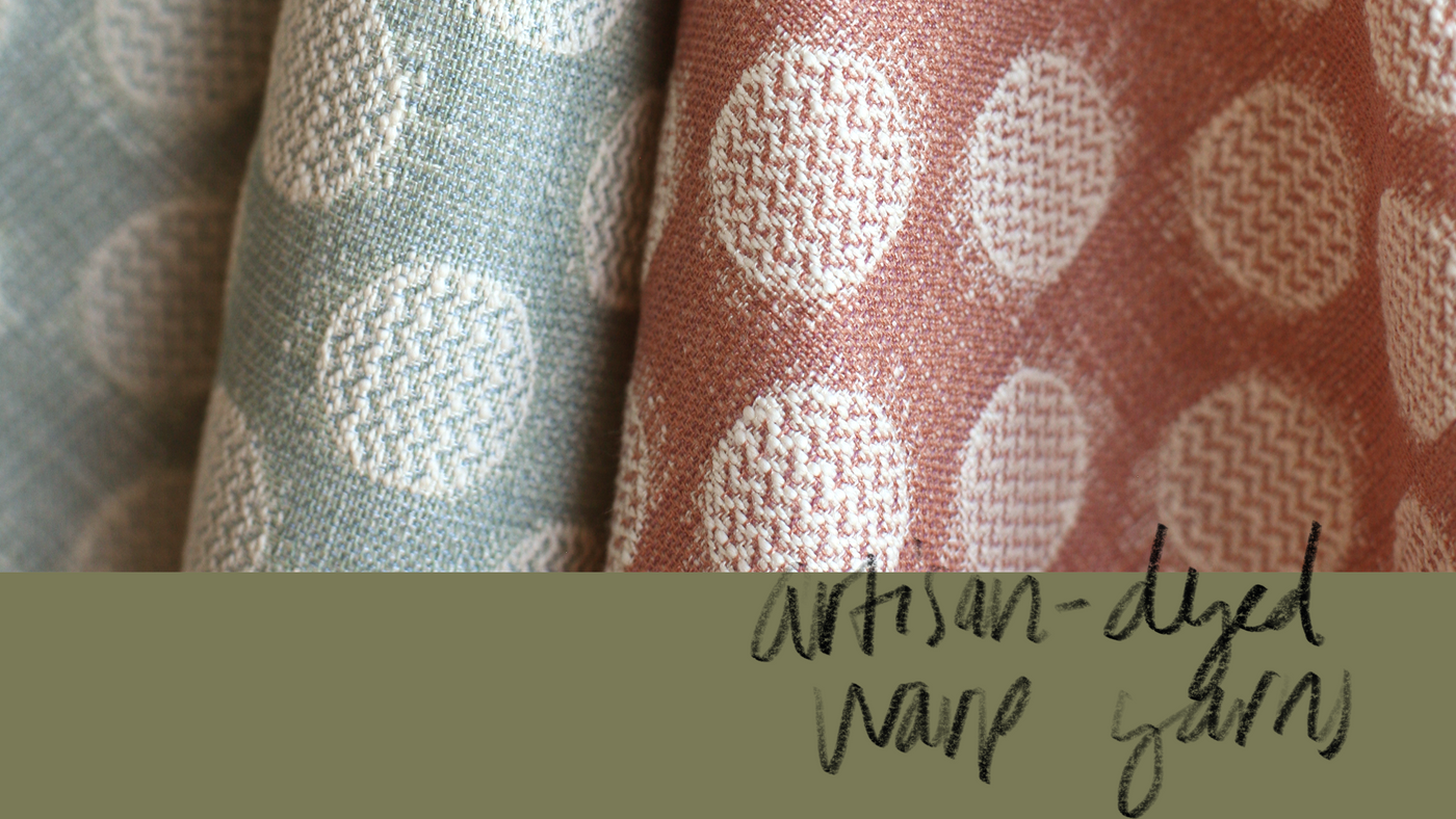
I find that when I start with colors I love, everything falls into place. The house looks ready without too much fuss or planning. These colors make it effortless to mix and match, and because they’re available in our performance fabric, you can use them to create a durable, comfortable base layer of outdoor cushions and pillows. Just add your favorite table linens and serveware—and company, of course.
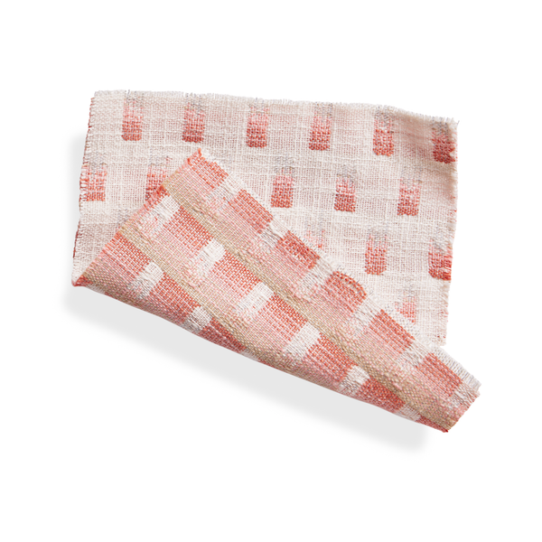
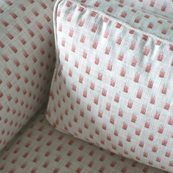
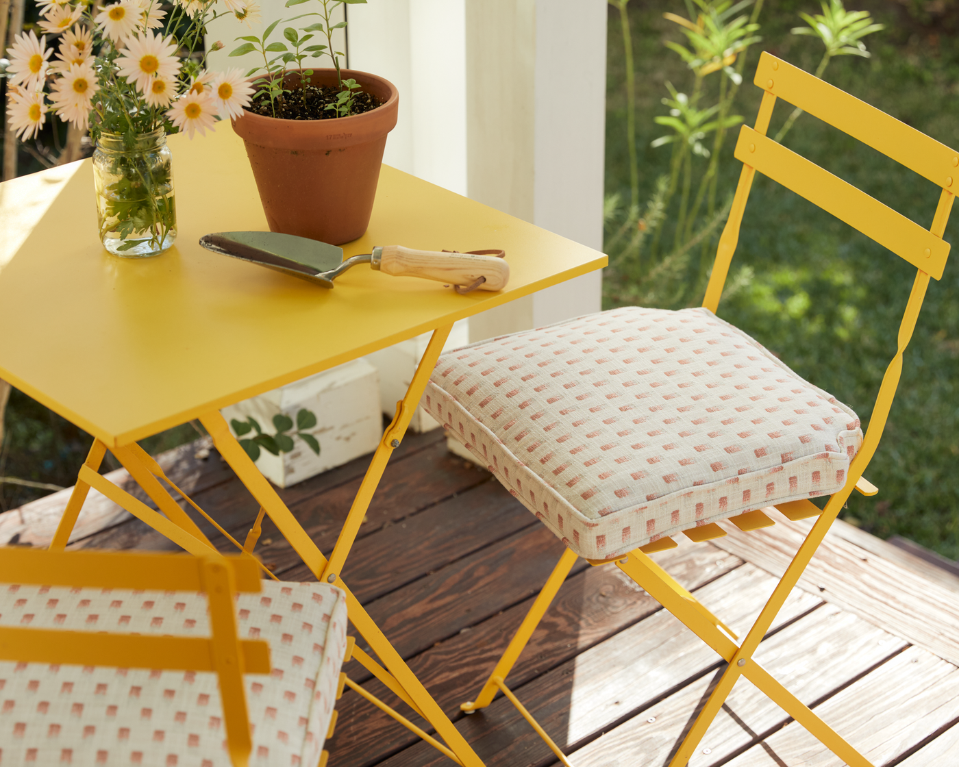
Butter Yellow + Warm Pink
This is the most cheerful color combination I can imagine—it’s instant sunshine and warmth. I love to set these colors against each other and see how they make everything and everyone feel brighter and happier.
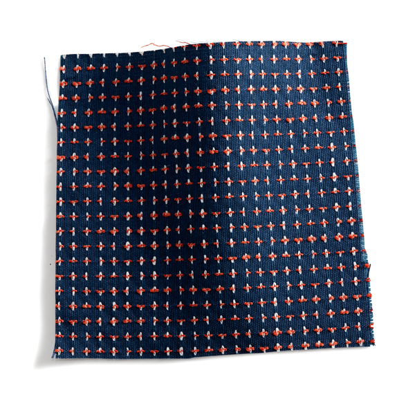
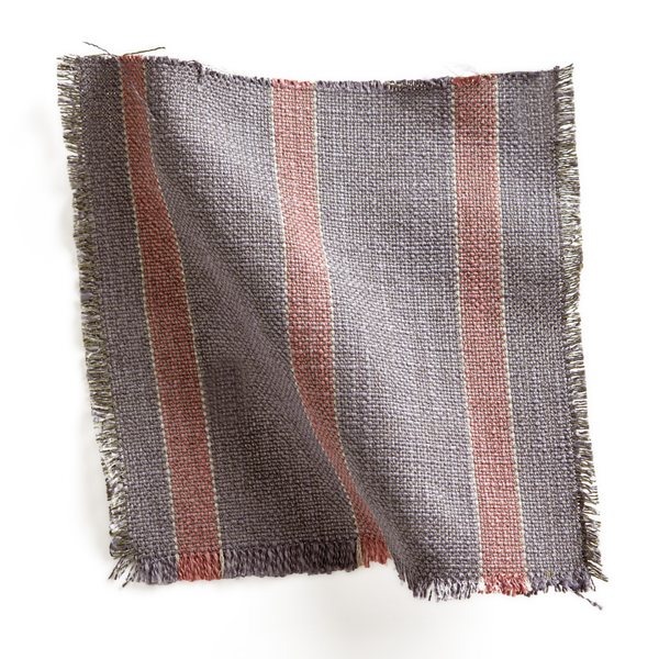
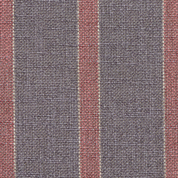
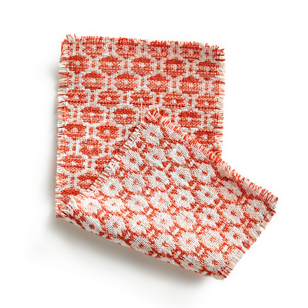
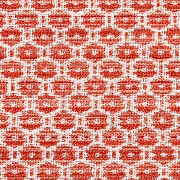
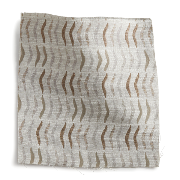
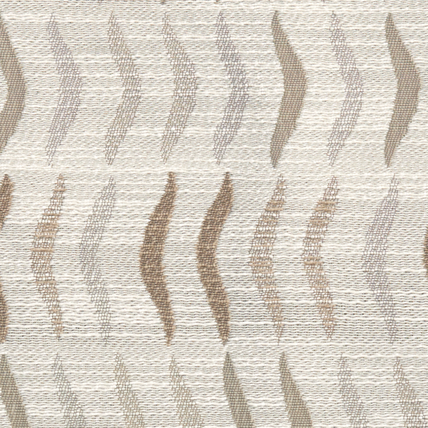
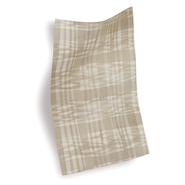
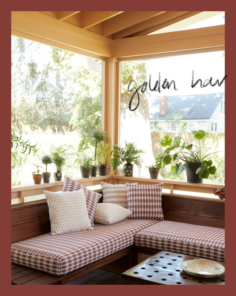
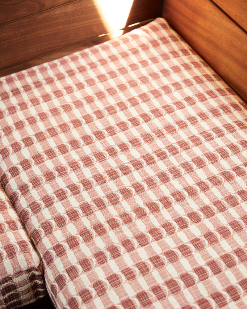
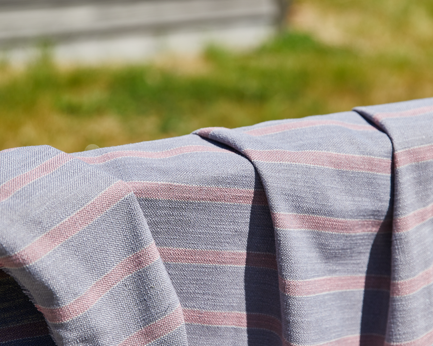
Dark Pinks + Wood Tones
The inspiration for this pairing is the sapele wood we used for our deck sofa which was designed by Kate Gray and built by Benjamin Paul Studio. It’s a common wood for the outdoors because it’s tough but beautiful, and it has reddish undertones that go perfectly with dark pinks. Together they look rich, unexpected, and earthy in a way that feels fresh.
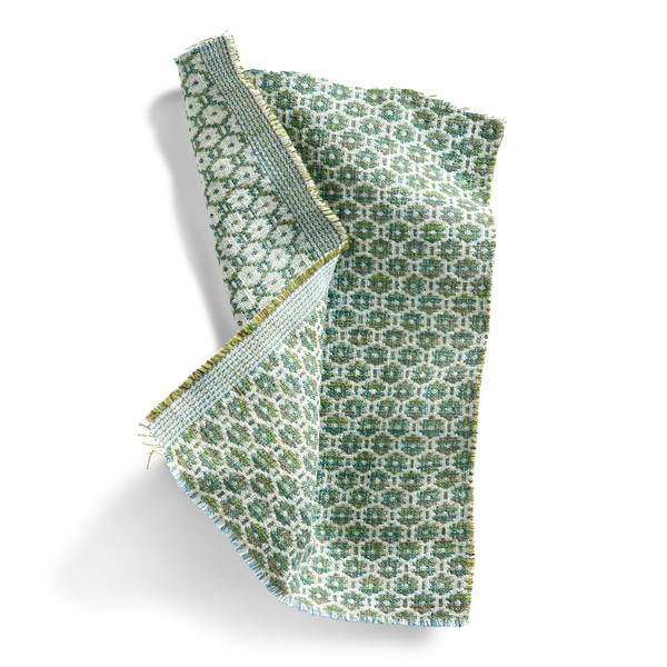
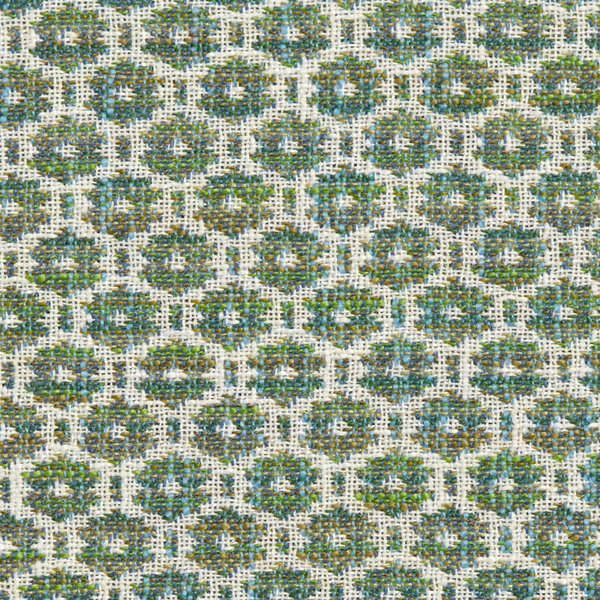
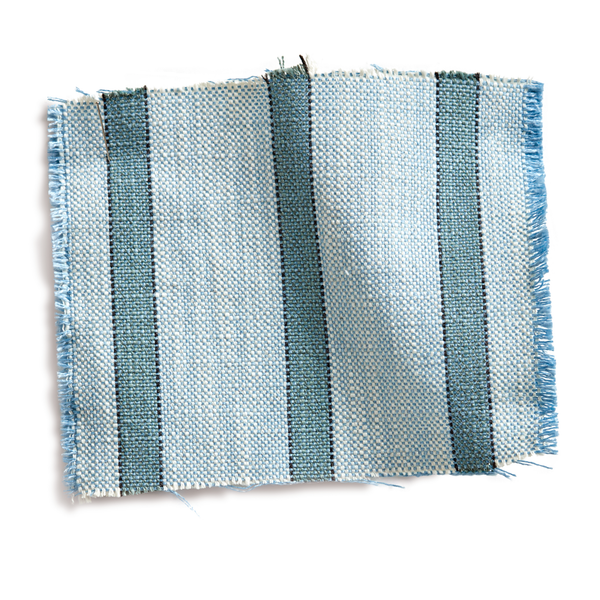
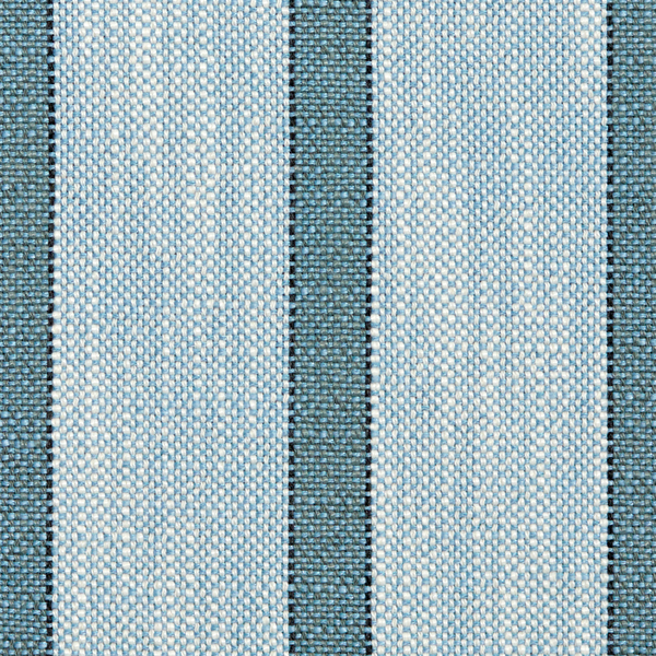
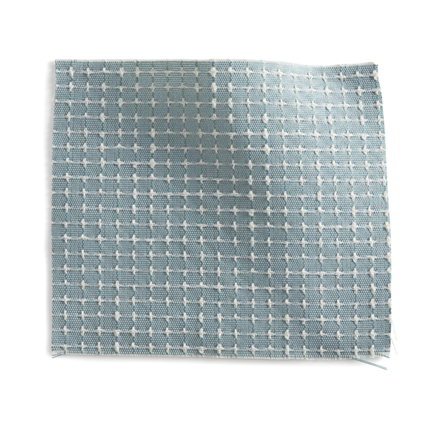
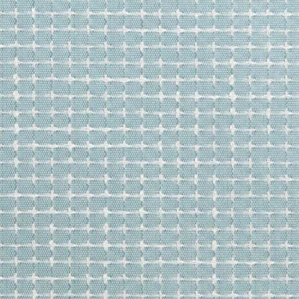
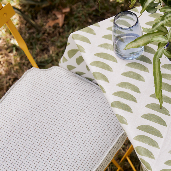
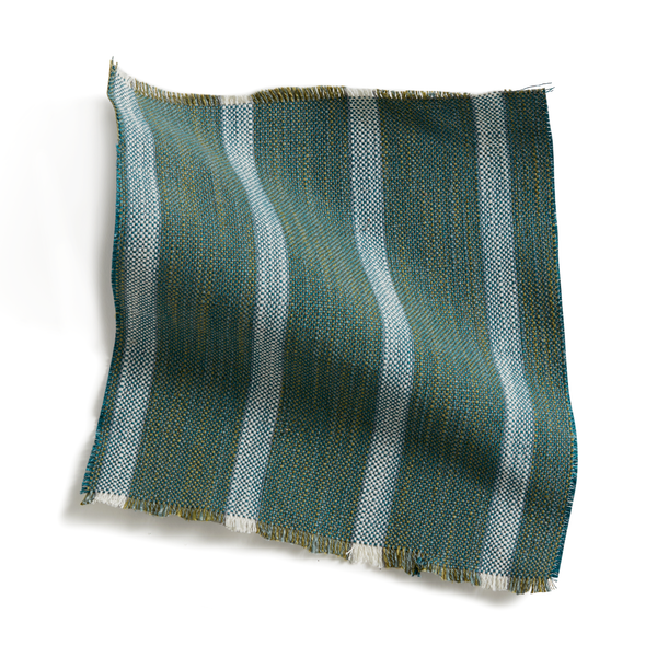
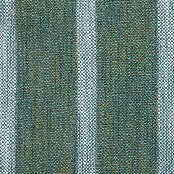
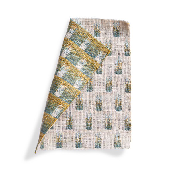
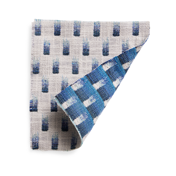
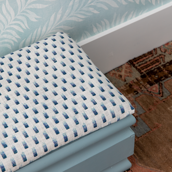
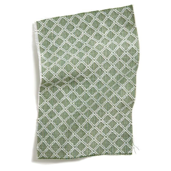
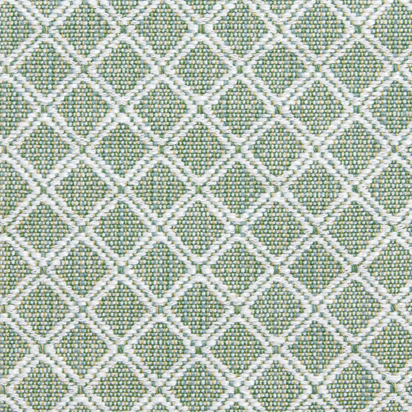
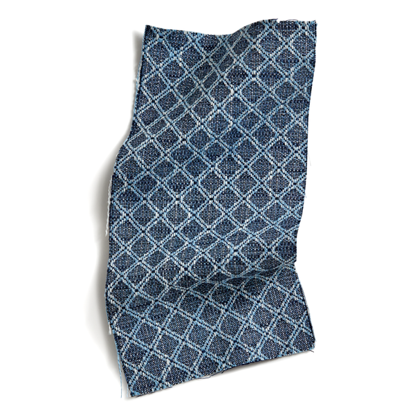
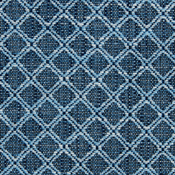
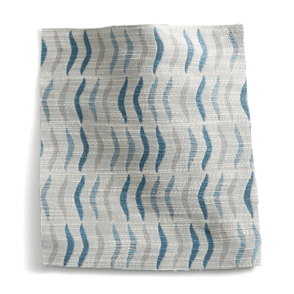
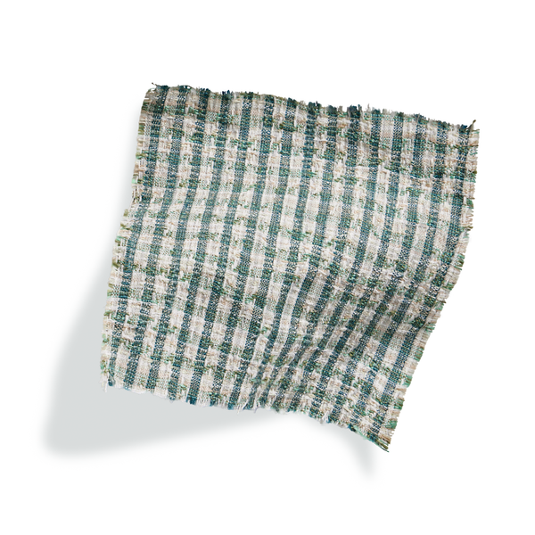
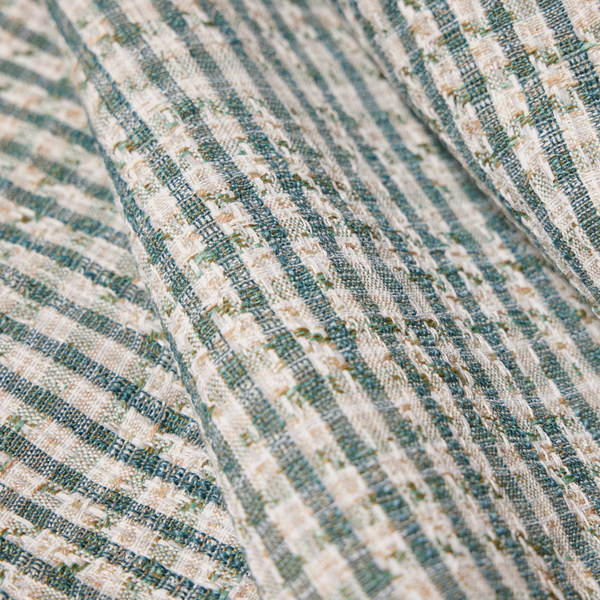
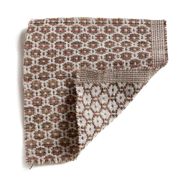
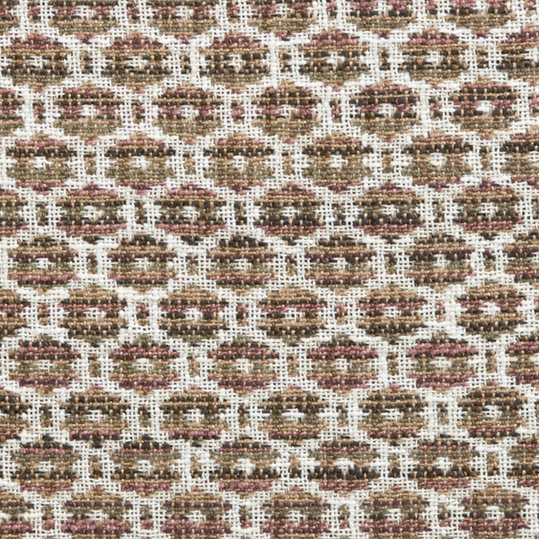
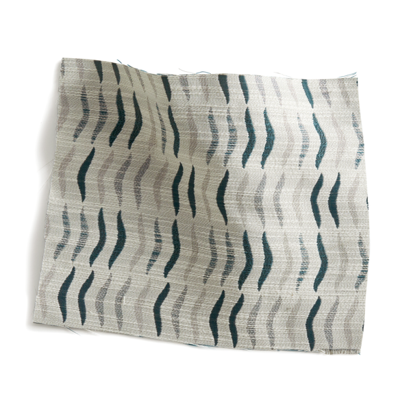
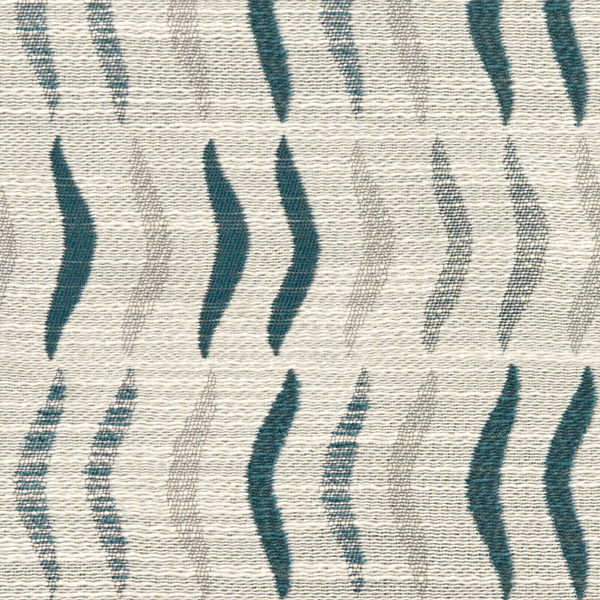
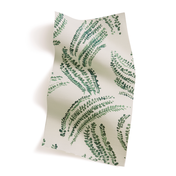
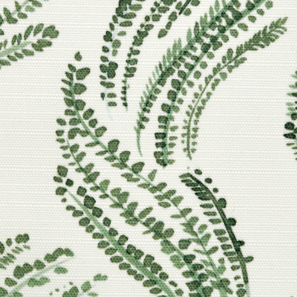
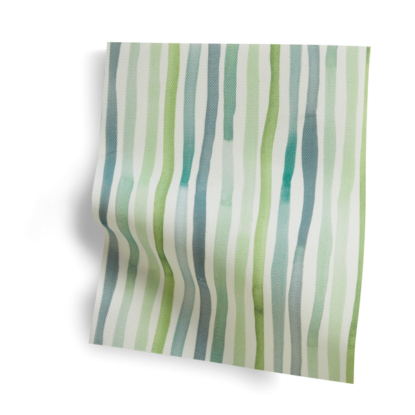
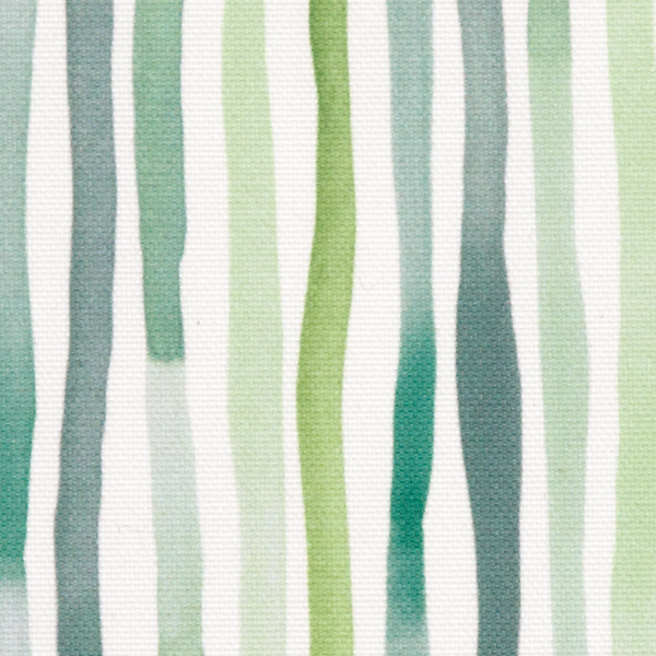
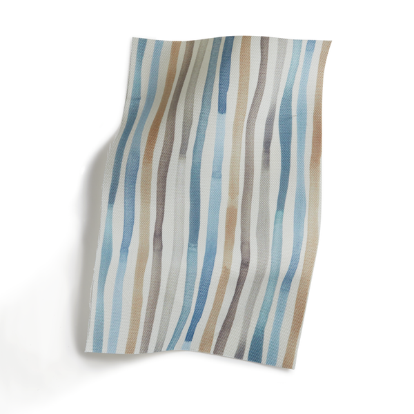
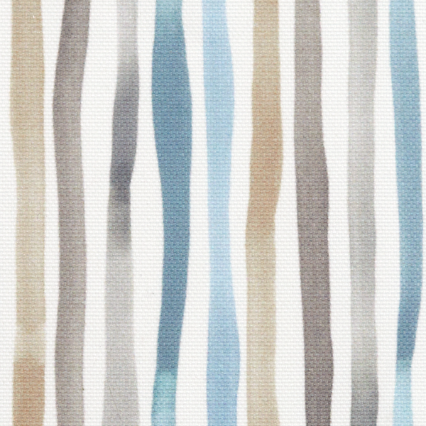
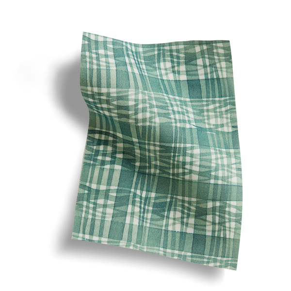
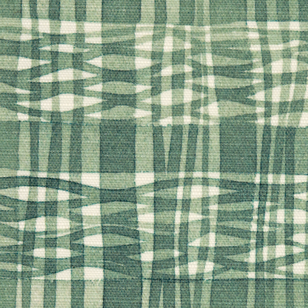
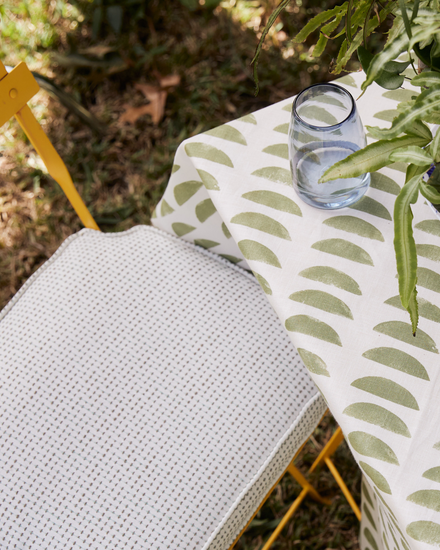
Soft, Tonal Greens
I love using green outdoors where your eye can go from the table to the grass and the trees and notice all the different variations. Fabrics in a range of green shades just look classic together. Sticking to one color family also lets you combine any patterns you like.
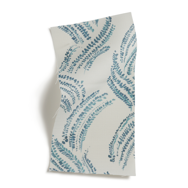
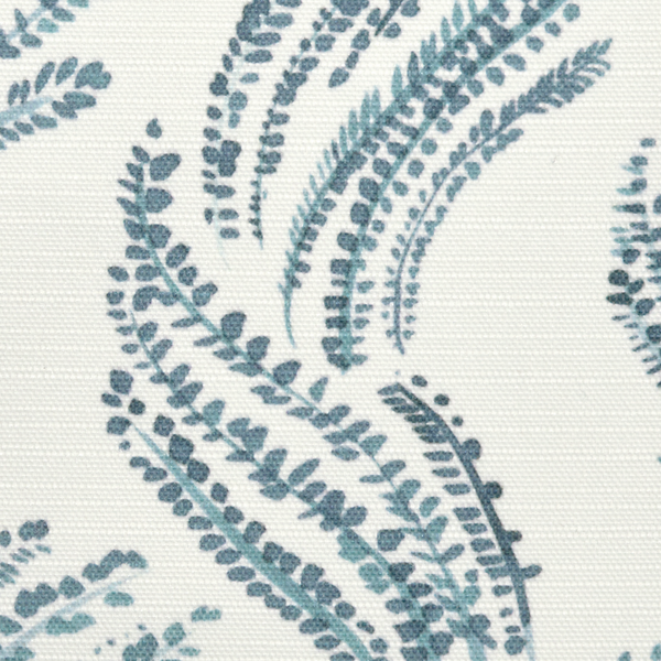
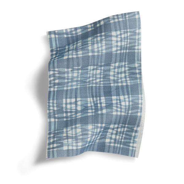
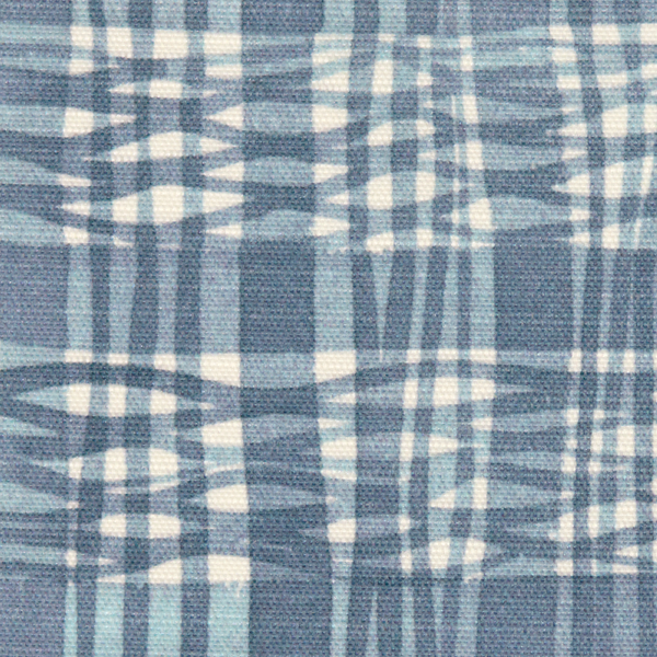
Purple + Green
I love when people use colors together that are close complements—just a bit off from being perfect complements. There’s a contrast, but it’s a less vibrant extreme. Purples with a bit of red in them go with greens so well. They’re so closely related; imagine how a pine tree can look purple in the right light. It’s a twist on a classic combination.
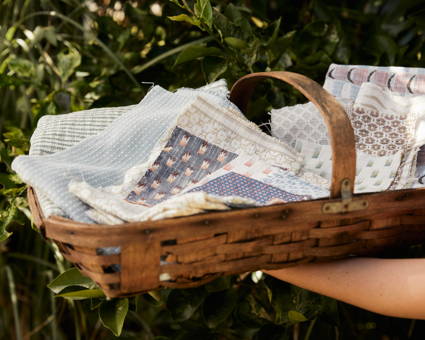
What are your favorite color palettes for the outdoors? Are there patterns or colors you want for outdoor applications? We love our performance fabrics and are proud of the wide variety of designs we offer, and we plan to grow our collection to offer even more choices. We’d love to hear your feedback. Send us a note at sales@rebeccaatwood.com and let us know what you think.